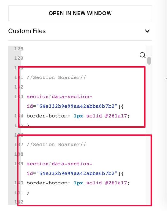
#1. Same CSS, you can remove one (Line 131 to 135)
//Section Boarder//

section[data-section-id="64e332b9e99aa42abba6b7b2"]{
border-bottom: 1px solid #261a17;
}

//Section Boarder//

section[data-section-id="64e332b9e99aa42abba6b7b2"]{
border-bottom: 1px solid #261a17;
}
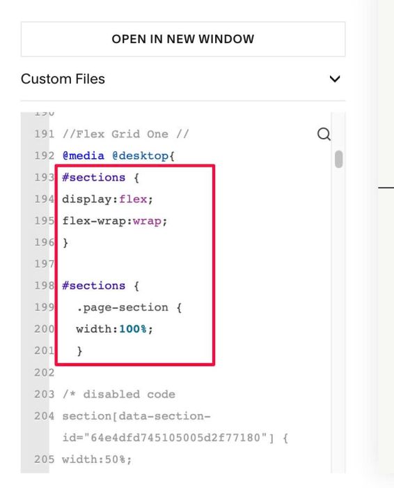
#2. You have some code like this (It repeated nearly 30 times, when just one time would have been enough.)
#sections {
display:flex;
flex-wrap:wrap;
}

#sections {
  .page-section {
  width:100%;
  }
Additionally, you can declare this line once and insert all the code within it, especially if you want to apply the code only on the desktop.
@media @desktop{
the format should be
@media @desktop {
all code here, code here will run on Dekstop Only
}
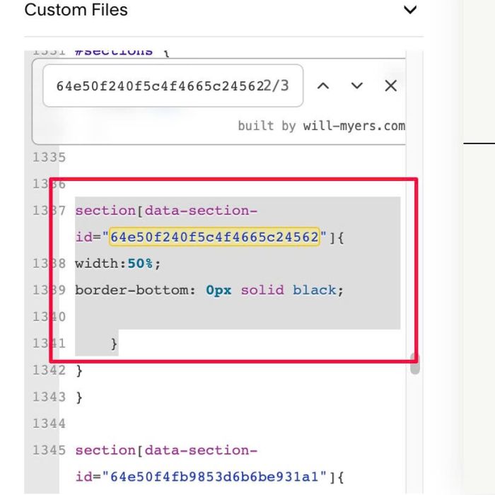
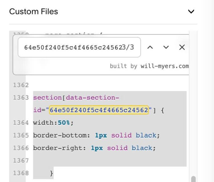
#3. You have this code
We can combine these three codes into a single code and simply add the width and border to the new code.
Line 1310 – Line 1314 (this code inside @media @desktop)
section[data-section-id="64e50f240f5c4f4665c24562"]{
width:50%;
border-bottom: 0px solid black;

    }
Line 1337 – Line 1341 (this code inside @media @desktop)
section[data-section-id="64e50f240f5c4f4665c24562"]{
width:50%;
border-bottom: 0px solid black;

    }
Line 1363 – Line 1368 (this code inside @media @desktop)
section[data-section-id="64e50f240f5c4f4665c24562"] {
width:50%;
border-bottom: 1px solid black;
border-right: 1px solid black;

    }
#4. Similar #3, but problem with this code
- We can keep Line 1318 – Line 1320, Line 1384 – Line 1388
- Two other codes, we can remove.
Line 1318 – Line 1320
section[data-section-id="64e50f4fb9853d6b6be931a1"]{
border-top: 1px solid #261a17;
}
Line 1345 – Line 1347
section[data-section-id="64e50f4fb9853d6b6be931a1"]{
border-top: 1px solid #261a17;
}
Line 1384 – Line 1388 (this code inside @media @desktop)
section[data-section-id="64e50f4fb9853d6b6be931a1"] {
width:50%;
border-bottom: 1px solid black;

    }
Line 1430 – Line 1434 (this code inside @media @desktop)
section[data-section-id="64e50f4fb9853d6b6be931a1"] {
width:50%;
border-bottom: 1px solid black;

    }
#5. You have this code, we can merge both into one
Line 711 – Line 713
section[data-section-id="64e380ade36a125f681fe51d"]{
border-top: 1px solid #261a17;
}
Line 1028 – Line 1030
section[data-section-id="64e380ade36a125f681fe51d"]{
border-bottom: 1px solid #261a17;
}
#6. There’s some other code like this, it’s not that important, but you can combine them too, if you want
For example
#6.1. Line 145 to Line 151
section[data-section-id="64e341d5b6bf7d46d2916bfd"]{
border-top: 1px solid #261a17;
}

section[data-section-id="64e341d5b6bf7d46d2916bfd"]{
border-bottom: 1px solid #261a17;
}
we can merge them
section[data-section-id="64e341d5b6bf7d46d2916bfd"]{
border-top: 1px solid #261a17;
border-bottom: 1px solid #261a17;
}
#6.2. Line 182 – Line 184
section[data-section-id="64e4ce98a4dfee33dd569ad8"]{
border-top: 1px solid #261a17;
}
Line 234 – Line 236
section[data-section-id="64e4ce98a4dfee33dd569ad8"]{
border-bottom: 1px solid #261a17;
}
Merge similar #6.1
#6.3. Similar with other IDs. You can use Search in CSS box to do this. I added extra Search feature to your custom CSS box.
64e375b9fe7dd77ccadd4889
64e3716a1002b872a6f167e5
64e36d9b368c647b157f4c89
64e367abcb110d0a12c7c036
64e863996416074b79f767dc
64e37c3c207e894ecf24f1d7
63ff1240597f963daacc5ea4
63f67af77c8d98007bab0f3f
64e380ade36a125f681fe51d
#7. I don’t see any code that uses these three variables, so you can remove them
Line 69 – Line 73
//**BREAKPOINTS**/

@maxBP: 1649px;
@deskBP: 768px;
@mBP: 767px;
#8. attribute SIZE is invalid ins this case, since this code isn’t running right now, it’s not necessary.
Line 1729 – 1794
/* ---- Square Refresh - Hover Row ---- */
// Desktop Title size
.hover-row .summary-title {
  font-size: SIZE !important;
}

// Desktop Excerpt size
.hover-row .summary-excerpt p {
  font-size: SIZE !important;
}

// Desktop Metadata size
.hover-row .summary-metadata-item {
  font-size: SIZE !important;
}

// Desktop Price size
.hover-row .product-price {
  font-size: SIZE !important;
}

// Tablet styles
@media screen and (max-width: 1024px) {
  // Tablet Title size
  .hover-row .summary-title {
    font-size: SIZE !important;
  }

  // Tablet Excerpt size
  .hover-row .summary-excerpt p {
    font-size: SIZE !important;
  }

  // Tablet Metadata size
  .hover-row .summary-metadata-item {
    font-size: SIZE !important;
  }

  // Tablet Price size
  .hover-row .product-price {
    font-size: SIZE !important;
  }
}

// Mobile styles
@media screen and (max-width: 700px) {
  // Mobile Title size
  .hover-row .summary-title {
    font-size: SIZE !important;
  }

  // Mobile Excerpt size
  .hover-row .summary-excerpt p {
    font-size: SIZE !important;
  }

  // Mobile Metadata size
  .hover-row .summary-metadata-item {
    font-size: SIZE !important;
  }

  // Mobile Price size
  .hover-row .product-price {
    font-size: SIZE !important;
  }
}
#9. I see you added comment NEWSLETTER BORDERS to these code. I’m not sure if your comment is correct, or if these codes aren’t intended for newsletter section.
Line 722 – Line 736
/*------------------------------------
// NEWSLETTER BORDERS
 *------------------------------------*/

section[data-section-id="64e49e61e7472950b69ee64e"]{
border-top: 1px solid #261a17;
}

section[data-section-id="63f67af77c8d98007bab0f3f"]{
border-top: 1px solid #261a17;
}

section[data-section-id="63f67af77c8d98007bab0f3f"]{
border-bottom: 1px solid #261a17;
}
#10. a typo in hex code, hex needs 3 or 6 characters, 7 is invalid
Line 124
background: #87a0a0c; /*line colour*/
#11. You declared these variables but you don’t use it in any codes. Line 80, Line 81
@tablet: ~"only screen and (max-width: 1024px) and (min-width:768px)";
@desktopXL: ~"only screen and (min-width: 1649px)";
#12. I also noticed a hex color code that repeats quite a lot, and it would be quite time-consuming if you need to change colors.
Therefore, instead using code like this
border-bottom: 1px solid #261a17;
We can
First, add an extra line like this to top of Custom CSS box
:root {
  --border-bottom-color: #261a17;
}
Next, change current code to something like this
border-bottom: 1px solid var(--border-bottom-color);
Therefore, simply changing the color at the top of the CSS box will cause all code using that variable to change color simultaneously.
#13. Or another similar approach
add line like this to top of CSS box
:root {
  --border-top: 1px solid #261a17;
  --border-bottom: 1px solid #261a17;
}
section[data-section-id="64e4ce98a4dfee33dd569ad8"]{
border-bottom: var(--border-bottom);
}
#14. Additionally, Squarespace recently released Anchor Link option. If you enter a word like this
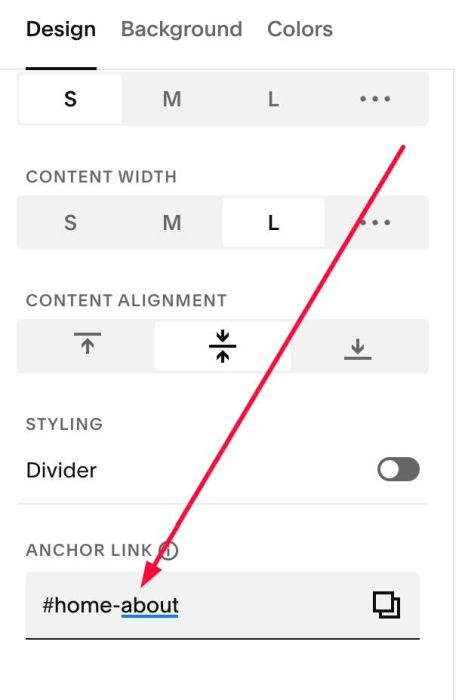
Then section will have ID like this: section#home-about
and this is same with default ID: section[data-section-id=”69aad215b9b41130fbce8c5b”]
section[data-section-id="69aad215b9b41130fbce8c5b"]
=
section#home-about
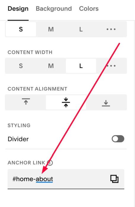
This way, you can change the current IDs to new IDs based on the Anchor Link, and it’s also easier to optimize and find duplicate codes in the future.