Description
- summary block carousel to single column on mobile
- view demo – password: abc
- buy me a coffee

#0. Explain case a bit
You have a Summary Block Carousel, and on mobile, you want to turn it to single column. I find that most people would recommend using this code in Custom CSS.
@media screen and (max-width: 767px) {
  .summary-v2-block .summary-item {
    width: 100% !important;
  }
}
It works, but if you check carefully, you’ll see a problem.
- For example, Summary Carousel has 6 items
- By default, on mobile, it shows 2 columns. Therefore, you will need to click the Right Arrow twice to see the 6 items.
- But if you use code to turn to 1 column, you will need to click Right Arrow 6 times
- And the CSS above failed to do that.
#1. Install Code
#1.1. Business Plan/higher
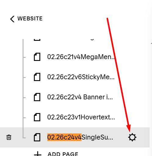
Hover on Page where you use Summary Block Carousel > Click Gear icon
Click Advanced > Paste this code
<!-- 05.26c17v1 Summary Carousel Single Column (Mobile) -->
<script src="https://code.beaverhero.com/summaryblock/0526c17v1singlecolumncarouselmobile.js"></script>

#1.2. Personal/Basic Plan
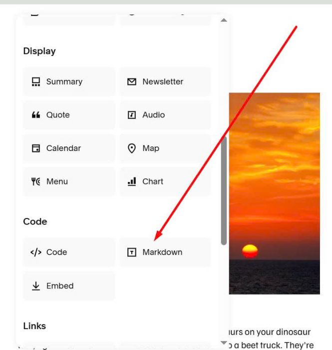
First, add a Markdown Block under Summary Block
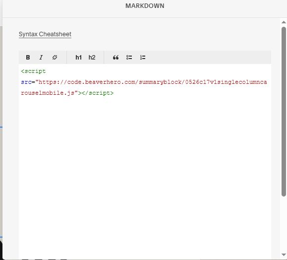
Paste this code into Markdown Block
<script src="https://code.beaverhero.com/summaryblock/0526c17v1singlecolumncarouselmobile.js"></script>