Description
- creating Buttons with Text Block
- view demo – password: abc
- buy me a coffee

#1. Install Code
#1.1. First, you can add a Text Block with unordered list, something like this

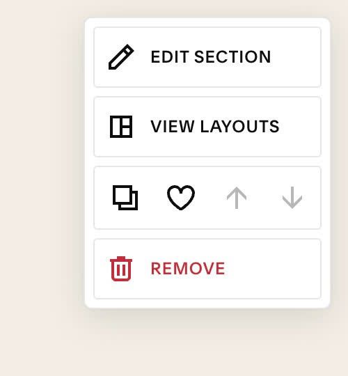
#1.2. Hover on top right of section > Click EDIT SECTION
#1.3. at Design > Anchor Link > enter word: text-button

#1.4. use this code to Custom CSS
body:not(.sqs-edit-mode-active) section[id*="text-button"] .html-block {
    ul {
        padding: 0px !important;
        display: flex;
        flex-wrap: wrap;
        gap: 10px;
        justify-content: center;
    }
    li p:before {
        display: none;
    }
    li p {
    	margin: 0px !important;
    }
    li a {
        border-width: var(--primary-button-stroke);
      	border-style: solid;
        border-radius: .4rem;
        padding: var(--primary-button-padding-y) var(--primary-button-padding-x) !important;
        font-style: var(--primary-button-font-font-style);
        font-weight: var(--primary-button-font-font-weight);
        line-height: var(--primary-button-font-line-height);
        letter-spacing: var(--primary-button-font-letter-spacing);
        text-transform: var(--primary-button-font-text-transform);
        color: var(--primaryButtonBackgroundColor);
        border-color: var(--primaryButtonBackgroundColor);
        font-family: "brother-1816", sans-serif !important;
        transition: .1s background-color linear, .1s color linear;
        display: inline-block;
        text-decoration: none !important;
    }
    li a:hover {
        background: var(--primaryButtonBackgroundColor);
        color: #fff;
        transition: .1s background-color linear, .1s color linear;
    }
}

#2. Customize
#2.1. Current Buttons use Primary Button Style, to turn it to Tertiary style, just use this new CSS code
body:not(.sqs-edit-mode-active) section[id*="text-button"] .html-block {
    ul {
        padding: 0px !important;
        display: flex;
        flex-wrap: wrap;
        gap: 10px;
        justify-content: center;
    }
    li p:before {
        display: none;
    }
    li p {
    	margin: 0px !important;
    }
    li a {
        border-width: var(--tertiary-button-stroke);
      	border-style: solid;
        border-radius: .4rem;
        padding: var(--tertiary-button-padding-y) var(--tertiary-button-padding-x) !important;
        font-style: var(--tertiary-button-font-font-style);
        font-weight: var(--tertiary-button-font-font-weight);
        line-height: var(--tertiary-button-font-line-height);
        letter-spacing: var(--tertiary-button-font-letter-spacing);
        text-transform: var(--tertiary-button-font-text-transform);
        color: var(--tertiaryButtonBackgroundColor);
        border-color: var(--tertiaryButtonBackgroundColor);
        font-family: "brother-1816", sans-serif !important;
        transition: .1s background-color linear, .1s color linear;
        display: inline-block;
        text-decoration: none !important;
    }
    li a:hover {
        background: var(--tertiaryButtonBackgroundColor);
        color: #fff;
        transition: .1s background-color linear, .1s color linear;
    }
}
#2.2. If you want to turn buttons to Secondary Style, use this new CSS code
body:not(.sqs-edit-mode-active) section[id*="text-button"] .html-block {
    ul {
        padding: 0px !important;
        display: flex;
        flex-wrap: wrap;
        gap: 10px;
        justify-content: center;
    }
    li p:before {
        display: none;
    }
    li p {
    	margin: 0px !important;
    }
    li a {
        border-width: var(--secondary-button-stroke);
      	border-style: solid;
        border-radius: .4rem;
        padding: var(--secondary-button-padding-y) var(--primary-button-padding-x) !important;
        font-style: var(--secondary-button-font-font-style);
        font-weight: var(--secondary-button-font-font-weight);
        line-height: var(--secondary-button-font-line-height);
        letter-spacing: var(--secondary-button-font-letter-spacing);
        text-transform: var(--secondary-button-font-text-transform);
        color: var(--secondaryuttonBackgroundColor);
        border-color: var(--secondaryButtonBackgroundColor);
        font-family: "brother-1816", sans-serif !important;
        transition: .1s background-color linear, .1s color linear;
        display: inline-block;
        text-decoration: none !important;
    }
    li a:hover {
        background: var(--secondaryButtonBackgroundColor);
        color: #fff;
        transition: .1s background-color linear, .1s color linear;
    }
}
#2.3. To change font family name of buttons, change this line
font-family: "brother-1816", sans-serif !important;
#2.4. To change space between buttons, change this line
gap: 10px;
#2.5. To apply it to specific Text Block in Section, you can find Text Block ID
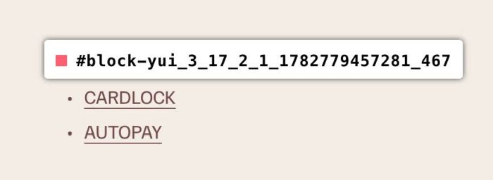
Then use CSS code like this
body:not(.sqs-edit-mode-active) #block-yui_3_17_2_1_1782779457281_467 .html-block {
    ul {
        padding: 0px !important;
        display: flex;
        flex-wrap: wrap;
        gap: 10px;
        justify-content: center;
    }
    li p:before {
        display: none;
    }
    li p {
    	margin: 0px !important;
    }
    li a {
        border-width: var(--primary-button-stroke);
      	border-style: solid;
        border-radius: .4rem;
        padding: var(--primary-button-padding-y) var(--primary-button-padding-x) !important;
        font-style: var(--primary-button-font-font-style);
        font-weight: var(--primary-button-font-font-weight);
        line-height: var(--primary-button-font-line-height);
        letter-spacing: var(--primary-button-font-letter-spacing);
        text-transform: var(--primary-button-font-text-transform);
        color: var(--primaryButtonBackgroundColor);
        border-color: var(--primaryButtonBackgroundColor);
        font-family: "brother-1816", sans-serif !important;
        transition: .1s background-color linear, .1s color linear;
        display: inline-block;
        text-decoration: none !important;
    }
    li a:hover {
        background: var(--primaryButtonBackgroundColor);
        color: #fff;
        transition: .1s background-color linear, .1s color linear;
    }
}