Description
- hover text show image as tooltip
- view demo – password: abc
- buy me a coffee

#1. Install Code
#1.1. Highlight text > Click Link icon > Enter url with format like this:
#tooltip_pageurlslug
for example
#tooltip_item-01

or
#tooltip_item-04

#1.2. Edit these pages > Add Images to Social Image

#1.3. Hover on Page where you use Text Block > Click Gear icon

#1.4. Click Advanced > Paste this code
- If you use Personal/Basic Plan and your plan doesn’t support Injection, see #3.1.
<!-- 07.26c28v3 Hover text show image tooltip -->
<script>
window.ImageTooltipConfig = {
  selector: 'a[href*="#tooltip_"]',
  preload: true,
  showDelay: 150,
  hideDelay: 100,
  position: 'top',
  offset: 12,
  fadeDuration: '200ms',
  imageFormat: '500w',
  tooltipWidth: '260px',
  backgroundColor: '#ffffff',
  borderRadius: '10px',
  padding: '4px',
  boxShadow: '0 8px 30px rgba(0,0,0,0.22)',
  showArrow: true,
  arrowSize: 7
};
</script>
<script src="https://code.beaverhero.com/textblock/0726c28v3hovertextimgtooltip.js"></script>

#2. Customize
#2.1. To change white background around image, change line 13
backgroundColor: '#ffffff',
#2.2. To change border radius of image, change line 14
borderRadius: '10px',
#2.3. To change shadow around image, change line 16
boxShadow: '0 8px 30px rgba(0,0,0,0.22)',
#3. Other
#3.1. If you use Personal/Basic Plan and your plan doesn’t support Injection, you can add a Markdown Block under Text Block.
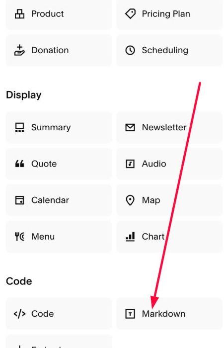
Add this code into Markdown
<script>
window.ImageTooltipConfig = {
  selector: 'a[href*="#tooltip_"]',
  preload: true,
  showDelay: 150,
  hideDelay: 100,
  position: 'top',
  offset: 12,
  fadeDuration: '200ms',
  imageFormat: '500w',
  tooltipWidth: '260px',
  backgroundColor: '#ffffff',
  borderRadius: '10px',
  padding: '4px',
  boxShadow: '0 8px 30px rgba(0,0,0,0.22)',
  showArrow: true,
  arrowSize: 7
};
</script>
<script src="https://code.beaverhero.com/textblock/0726c28v3hovertextimgtooltip.js"></script>
