Description
- Recto: A Magazine-Style Photography Website Template
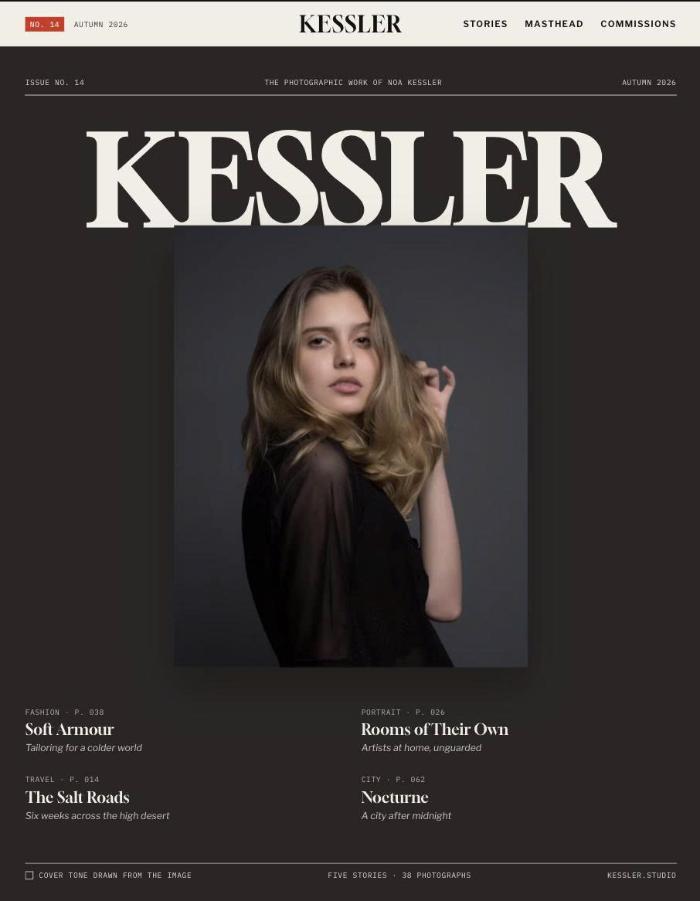
- Recto gives your photography the feel of a printed magazine, with a cover, a table of contents, page numbers and stories laid out as spreads. As visitors move through each horizontal gallery, the background shifts to a tone drawn from the photograph on screen. Every image sits in its own colour, the way an art director would frame it.
- view demo – password: abc
- buy me a coffee
- download template
Who it’s for
- Editorial and travel photographers
- Fashion and portrait photographers who work in stories and series
- Photojournalists and documentary photographers
- Photographers who sell fine art prints and take commissions
Pages included
- Cover
- Magazine-style cover: oversized masthead, cover image and cover lines linking to stories
- Cover background coloured by the cover photograph
- “In this issue” table of contents with page numbers and colour-matched thumbnails
- Featured story in a horizontal gallery with adaptive background
- Editor’s letter with portrait, drop cap and column layout
- Commission call-to-action band
- Stories
- Contents page with section filters (Travel, Portrait, Fashion, Still life, City)
- Story cards framed in a colour pulled from each lead image
- Story pages
- Opening spread: large title, standfirst and byline details (location, year, client)
- Horizontal gallery that pins while you scroll, with a background that changes to match each photograph
- Figure captions, running page numbers, progress bar and frame counter
- Pull quote within the gallery
- Closing text in columns
- “Next story” link with a colour-matched preview
- Masthead
- Photographer portrait with an image-matched frame
- Bio and colophon-style details
- “Published in” grid
- Awards and exhibitions list
- Commissions
- Rates for editorial, campaign and print work
- Studio and agent contacts
- Enquiry form with type of work, dates and location, plus a confirmation message
- Throughout
- Full-screen photo viewer whose background matches each image, with arrow-key and swipe navigation
- Page-turn transitions between pages
- Full-screen mobile contents menu
- Footer with oversized masthead and colophon