Description
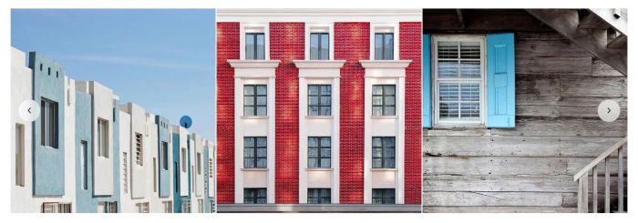
- turn Grid to Carousel in Gallery Block
- option to set columns on desktop/mobile
- option to have overlay color
- option to have space between images
- ..
- view demo – password: abc

#1. Install Code
#1.1. First, make sure you changed Gallery Block to GRID

#1.2. Hover on top right of section > Click Edit Section

at Anchor Link, enter word: link-slide

If you have multiple sections that need the effect applied, you can use link-slide02, link-slide03… on those sections.

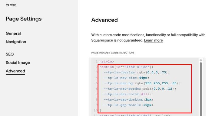
#1.3. Hover on page where you use Gallery Block > Click Gear icon

Click Advanced > Paste this code
<style>
section[id*="link-slide"]{
  --tp-ls-overlay:rgba(0,0,0,.75);
  --tp-ls-nav-size:44px;
  --tp-ls-nav-bg:rgba(255,255,255,.65);
  --tp-ls-nav-border:rgba(0,0,0,.12);
  --tp-ls-nav-color:#111;
  --tp-ls-gap-desktop:2px;
  --tp-ls-gap-mobile:10px;
}
section[id*="link-slide"] .tp-link-slide{width:100%;max-width:100%;margin:0}section[id*="link-slide"] .tp-link-slide .swiper{width:100%;position:relative;overflow:hidden;border-radius:var(--tp-ls-radius)}section[id*="link-slide"] .tp-link-slide .swiper-slide{height:auto}section[id*="link-slide"] .tp-link-slide__a{position:relative;display:block;width:100%;height:100%;overflow:hidden;background:#f3f3f3}section[id*="link-slide"] .tp-link-slide__img{width:100%;height:100%;display:block;aspect-ratio:1/1;object-fit:cover}section[id*="link-slide"] .tp-link-slide__ov{position:absolute;inset:0;background:var(--tp-ls-overlay);opacity:0;transition:opacity .18s ease;pointer-events:none}@media (hover:hover){section[id*="link-slide"] .tp-link-slide__a:hover .tp-link-slide__ov{opacity:1}}section[id*="link-slide"] .tp-link-slide__nav{position:absolute;top:50%;transform:translateY(-50%);width:var(--tp-ls-nav-size);height:var(--tp-ls-nav-size);border-radius:999px;border:1px solid var(--tp-ls-nav-border);background:var(--tp-ls-nav-bg);color:var(--tp-ls-nav-color);display:grid;place-items:center;cursor:pointer;z-index:5;backdrop-filter:saturate(1.2) blur(6px);-webkit-tap-highlight-color:#fff0}section[id*="link-slide"] .tp-link-slide__nav svg{width:18px;height:18px}section[id*="link-slide"] .tp-link-slide__prev{left:14px}section[id*="link-slide"] .tp-link-slide__next{right:14px}@media (max-width:767px){section[id*="link-slide"] .tp-link-slide__prev{left:10px}section[id*="link-slide"] .tp-link-slide__next{right:10px}}
</style>
<link rel="stylesheet" href="https://cdn.jsdelivr.net/npm/swiper@11/swiper-bundle.min.css"/>
<script src="https://cdn.jsdelivr.net/npm/swiper@11/swiper-bundle.min.js"></script>
<script src="https://code.beaverhero.com/galleryblock/gbcarousel.js"></script>

#2. Customize
#2.1. Columns of Images
By default, it is 3 columns on desktop and 1.15 column on mobile
To set specific Gallery Block to specific column, first you need to find Gallery Block ID.

Then use code like this under plugin code
<style>
#block-01d74b56e7d61ff30dd8{
  --desktop-columns:4;
  --mobile-columns:2.15;
}

#block-0a5357a1eb8fcd982a19{
  --desktop-columns:3;
  --mobile-columns:1.6;
}

#block-4efd888b2e44aa836b5d{
  --desktop-columns:2.5;
  --mobile-columns:1.15;
}
</style>

#2.2. To change overlay color, left/right arrow style, gap between images, you can change these options
section[id*="link-slide"]{
  --tp-ls-overlay:rgba(0,0,0,.75);
  --tp-ls-nav-size:44px;
  --tp-ls-nav-bg:rgba(255,255,255,.65);
  --tp-ls-nav-border:rgba(0,0,0,.12);
  --tp-ls-nav-color:#111;
  --tp-ls-gap-desktop:2px;
  --tp-ls-gap-mobile:10px;
}