Description
- adding testimonial carousel (text only) with text block
- view demo – password: abc
- buy me a coffee
#1. Install Code
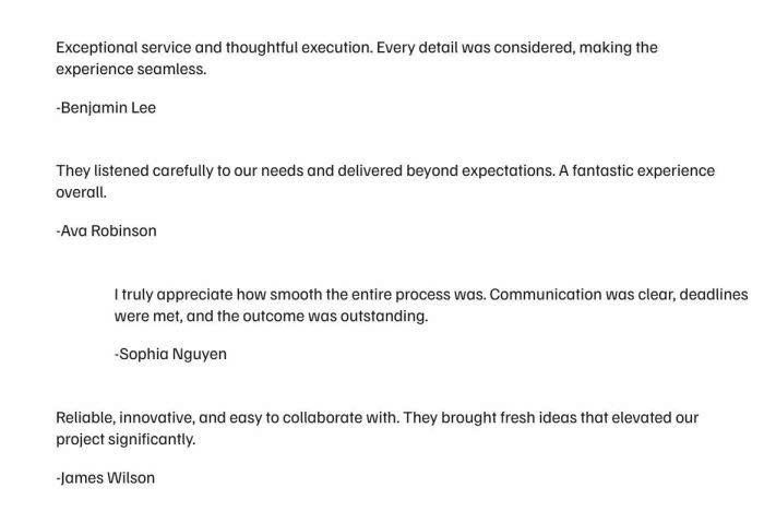
#1.1. First, you need to add some Text Blocks, like this (here I use 4 Text Blocks)
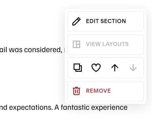
#1.2. Hover on top right of section > Click Edit Section
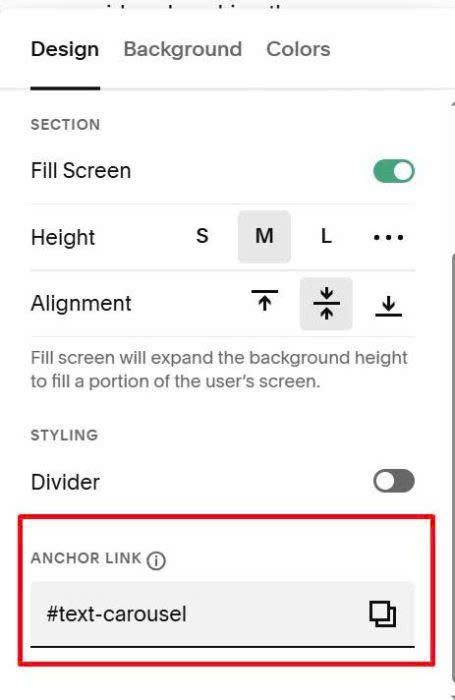
at Anchor Link, enter: text-carousel
text-carousel
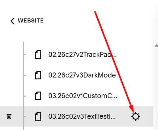
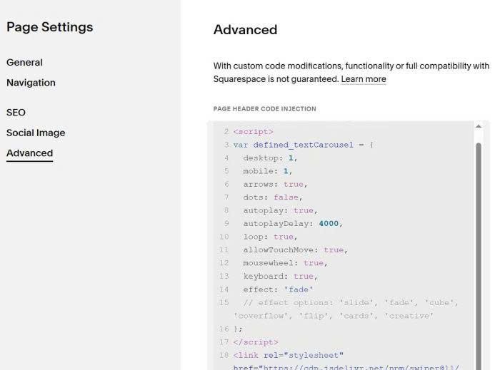
#1.3. Hover on page where you added Text Blocks > Click Gear icon
Click Advanced > Paste this code
<!-- 03.26c02v3 - Text Carousel -->
<script>
var defined_textCarousel = {
  desktop: 1,
  mobile: 1,
  arrows: true,
  dots: false,
  autoplay: true,
  autoplayDelay: 4000,
  loop: true,
  allowTouchMove: true,
  mousewheel: true,
  keyboard: true,
  effect: 'fade'
  // effect options: 'slide', 'fade', 'cube', 'coverflow', 'flip', 'cards', 'creative'
};
</script>
<link rel="stylesheet" href="https://cdn.jsdelivr.net/npm/swiper@11/swiper-bundle.min.css">
<script src="https://cdn.jsdelivr.net/npm/swiper@11/swiper-bundle.min.js"></script>
<script src="https://code.beaverhero.com/textblock/0326c02v3textcarousel.js"></script>
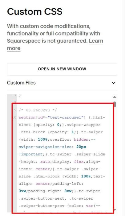
#1.4. Use this code to Custom CSS
/* 03.26c02v3 */
section[id*="text-carousel"] {.html-block {opacity: 0;}.swiper-wrapper .html-block {opacity: 1;}.tc-swiper {width: 100%;overflow: hidden;--swiper-navigation-size: 20px !important;}.tc-swiper .swiper-slide {height: auto;display: flex;align-items: center;}.tc-swiper .swiper-slide .html-block {width: 100%;text-align: center;padding-left: 3vw;padding-right: 3vw;}.tc-swiper .swiper-button-next, .tc-swiper .swiper-button-prev {color: var(--primaryButtonBackgroundColor, #000);} .tc-swiper .swiper-pagination-bullet-active {background: var(--primaryButtonBackgroundColor, #000);}}
#2. Customize
You can see all options here
var defined_textCarousel = {
  desktop: 1,
  mobile: 1,
  arrows: true,
  dots: false,
  autoplay: true,
  autoplayDelay: 4000,
  loop: true,
  allowTouchMove: true,
  mousewheel: true,
  keyboard: true,
  effect: 'fade'
  // effect options: 'slide', 'fade', 'cube', 'coverflow', 'flip', 'cards', 'creative'
};