Description
- before after image slider
- view demo – password: abc
- buy me a coffee
#1. Install Code
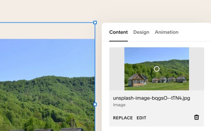
#1.1. First you need to add an Image Block and upload your desired image
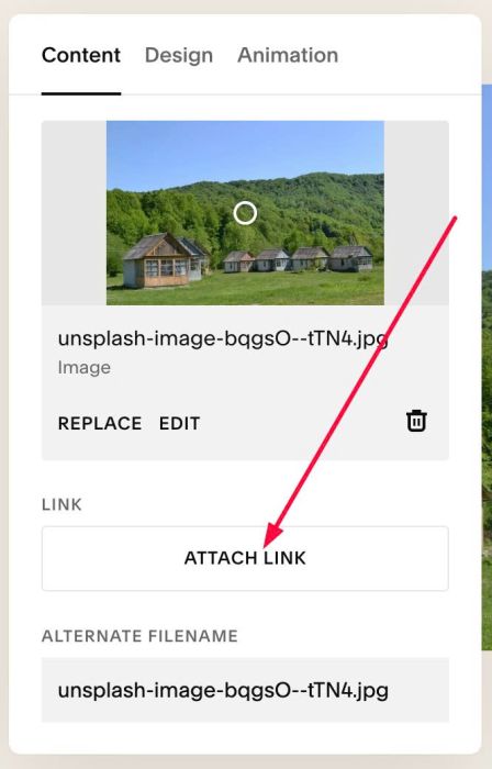
#1.2. Click Attach Link
#1.3. at URL > Choose File
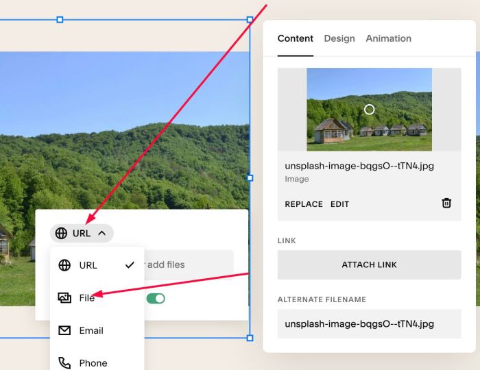
#1.4. Upload second image (we will use it as After image)
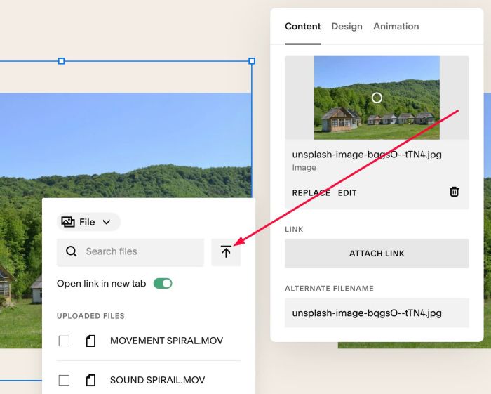
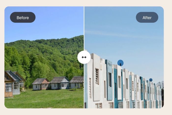
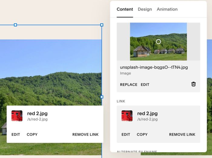
Result something like this
#1.5. Hover on top right of Section > Click EDIT SECTION
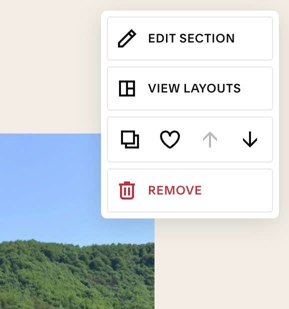
at Anchor Link, enter word: before-after
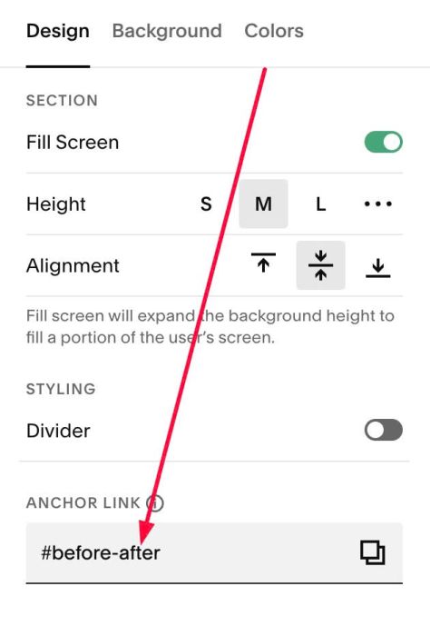
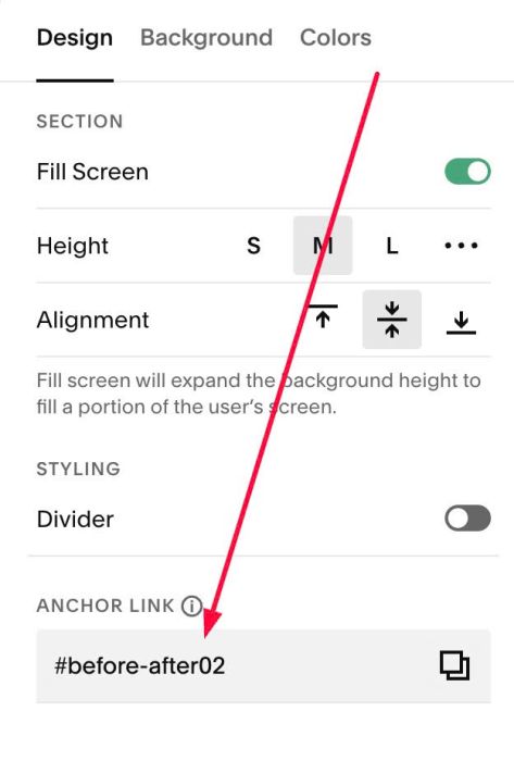
#1.5-2. If you have multiple sections and want to add Before After effect to these sections, just use anchor link: before-after02, before-after03…
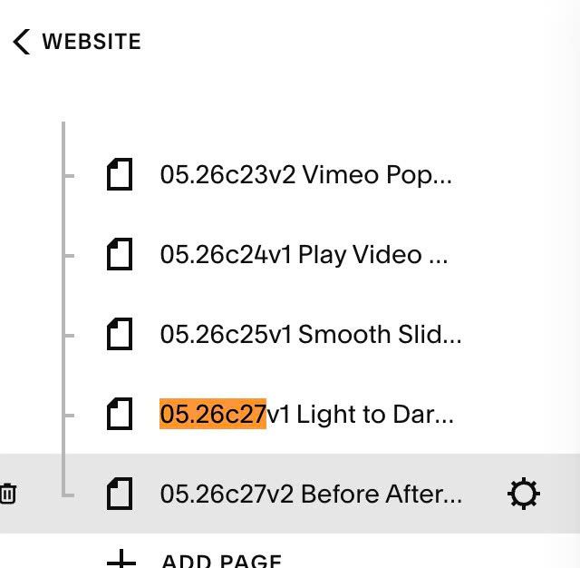
#1.6. Hover on Page where you added Images > Click Gear icon
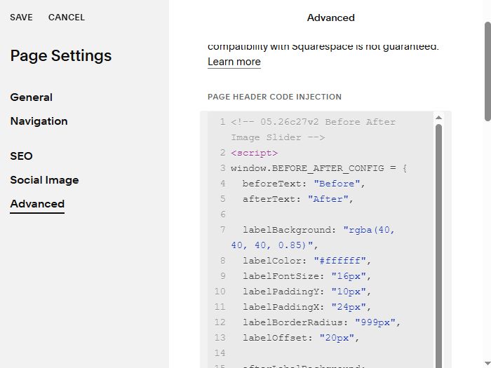
Click Advanced > Paste this code
- If you use Personal/Basic Plan and your plan doesn’t support Injection, you can see #3.1
<!-- 05.26c27v2 Before After Image Slider -->
<script>
window.BEFORE_AFTER_CONFIG = {
  beforeText: "Before",
  afterText: "After",

  labelBackground: "rgba(40, 40, 40, 0.85)",
  labelColor: "#ffffff",
  labelFontSize: "16px",
  labelPaddingY: "10px",
  labelPaddingX: "24px",
  labelBorderRadius: "999px",
  labelOffset: "20px",

  afterLabelBackground: "rgba(60, 75, 95, 0.85)",
  afterLabelColor: "#ffffff",

  arrowHandleBackground: "#ffffff",
  arrowHandleSize: "48px",
  arrowHandleShadow: "0 2px 12px rgba(0,0,0,0.15)",
  arrowIconColor: "#000000",
  arrowIconSize: "18px",
  arrowIconSvg: `<svg xmlns="http://www.w3.org/2000/svg" viewBox="0 0 640 640"><path d="M502.6 438.6L598.6 342.6C611.1 330.1 611.1 309.8 598.6 297.3L502.6 201.3C490.1 188.8 469.8 188.8 457.3 201.3C444.8 213.8 444.8 234.1 457.3 246.6L498.7 288L141.2 288L182.6 246.6C195.1 234.1 195.1 213.8 182.6 201.3C170.1 188.8 149.8 188.8 137.3 201.3L41.3 297.3C35.3 303.3 31.9 311.4 31.9 319.9C31.9 328.4 35.3 336.5 41.3 342.5L137.3 438.5C149.8 451 170.1 451 182.6 438.5C195.1 426 195.1 405.7 182.6 393.2L141.2 351.8L498.7 351.8L457.3 393.2C444.8 405.7 444.8 426 457.3 438.5C469.8 451 490.1 451 502.6 438.5z"/></svg>`,

  dividerLineColor: "#ffffff",
  dividerLineWidth: "2px",

  imageBorderRadius: "16px",

  startPosition: 50,

  skeletonText: "Loading Before & After Slider...",
  skeletonBackground: "#f0ede8",
  skeletonShimmerColor: "rgba(255,255,255,0.6)",
  skeletonTextColor: "#999999",
  skeletonTextSize: "14px",
  skeletonAspectRatio: "3/2"
};
</script>
<script src="https://code.beaverhero.com/imageblock/0526c27v2beforeafterimgslider.js"></script>
#2. Customize
#2.1. To change text Before/After, change line 04, 05
beforeText: "Before",
 afterText: "After",
#2.2. To change text Before/After style, change line 07 to line 13
labelBackground: "rgba(40, 40, 40, 0.85)",
labelColor: "#ffffff",
labelFontSize: "16px",
labelPaddingY: "10px",
labelPaddingX: "24px",
labelBorderRadius: "999px",
labelOffset: "20px",
#2.3. To change text “After” background, change line 15
afterLabelBackground: "rgba(60, 75, 95, 0.85)",
#2.4. To change arrow icon style, change Line 17 to Line 22
arrowHandleBackground: "#ffffff",
arrowHandleSize: "48px",
arrowHandleShadow: "0 2px 12px rgba(0,0,0,0.15)",
arrowIconColor: "#000000",
arrowIconSize: "18px",
#2.5. To change arrow to another icon, change line 23. Here I use svg icon from FontAwesome.com. You can find free svg icon there
arrowIconSvg: `<svg xmlns="http://www.w3.org/2000/svg" viewBox="0 0 640 640"><path d="M502.6 438.6L598.6 342.6C611.1 330.1 611.1 309.8 598.6 297.3L502.6 201.3C490.1 188.8 469.8 188.8 457.3 201.3C444.8 213.8 444.8 234.1 457.3 246.6L498.7 288L141.2 288L182.6 246.6C195.1 234.1 195.1 213.8 182.6 201.3C170.1 188.8 149.8 188.8 137.3 201.3L41.3 297.3C35.3 303.3 31.9 311.4 31.9 319.9C31.9 328.4 35.3 336.5 41.3 342.5L137.3 438.5C149.8 451 170.1 451 182.6 438.5C195.1 426 195.1 405.7 182.6 393.2L141.2 351.8L498.7 351.8L457.3 393.2C444.8 405.7 444.8 426 457.3 438.5C469.8 451 490.1 451 502.6 438.5z"/></svg>`,
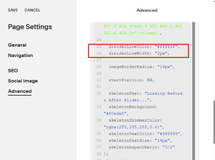
#2.6. To change Divider style
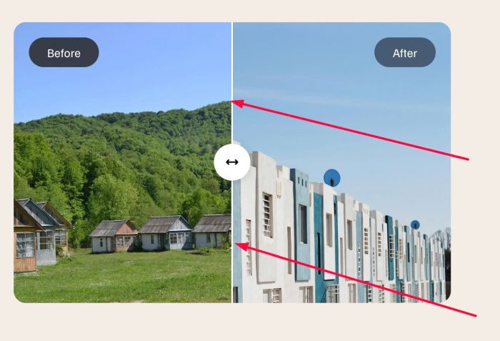
change line 25, 26
dividerLineColor: "#ffffff",
  dividerLineWidth: "2px",
#2.7. To change round corners of image, change line 28
imageBorderRadius: "16px",
#2.8. To change loading text “Loading Before & After Slider…” before you see After Before After, you can change line 32 to line 38
skeletonText: "Loading Before & After Slider...",
skeletonBackground: "#f0ede8",
skeletonShimmerColor: "rgba(255,255,255,0.6)",
skeletonTextColor: "#999999",
skeletonTextSize: "14px",
skeletonAspectRatio: "3/2"
#3. Other
If you use Personal/Basic Plan and your plan doesn’t support Injection, you can edit current page > Add a Block
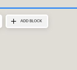
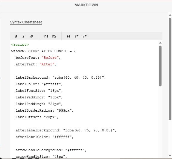
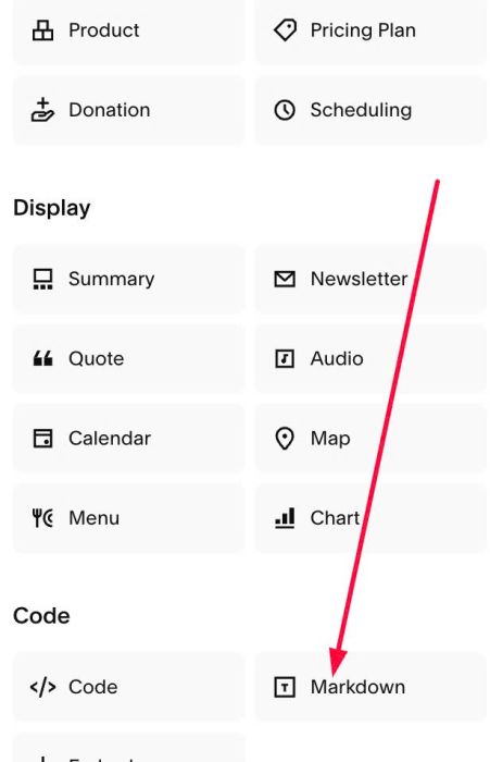
Choose Markdown
Add this code into Markdown
<script>
window.BEFORE_AFTER_CONFIG = {
  beforeText: "Before",
  afterText: "After",

  labelBackground: "rgba(40, 40, 40, 0.85)",
  labelColor: "#ffffff",
  labelFontSize: "16px",
  labelPaddingY: "10px",
  labelPaddingX: "24px",
  labelBorderRadius: "999px",
  labelOffset: "20px",

  afterLabelBackground: "rgba(60, 75, 95, 0.85)",
  afterLabelColor: "#ffffff",

  arrowHandleBackground: "#ffffff",
  arrowHandleSize: "48px",
  arrowHandleShadow: "0 2px 12px rgba(0,0,0,0.15)",
  arrowIconColor: "#000000",
  arrowIconSize: "18px",
  arrowIconSvg: `<svg xmlns="http://www.w3.org/2000/svg" viewBox="0 0 640 640"><path d="M502.6 438.6L598.6 342.6C611.1 330.1 611.1 309.8 598.6 297.3L502.6 201.3C490.1 188.8 469.8 188.8 457.3 201.3C444.8 213.8 444.8 234.1 457.3 246.6L498.7 288L141.2 288L182.6 246.6C195.1 234.1 195.1 213.8 182.6 201.3C170.1 188.8 149.8 188.8 137.3 201.3L41.3 297.3C35.3 303.3 31.9 311.4 31.9 319.9C31.9 328.4 35.3 336.5 41.3 342.5L137.3 438.5C149.8 451 170.1 451 182.6 438.5C195.1 426 195.1 405.7 182.6 393.2L141.2 351.8L498.7 351.8L457.3 393.2C444.8 405.7 444.8 426 457.3 438.5C469.8 451 490.1 451 502.6 438.5z"/></svg>`,

  dividerLineColor: "#ffffff",
  dividerLineWidth: "2px",

  imageBorderRadius: "16px",

  startPosition: 50,

  skeletonText: "Loading Before & After Slider...",
  skeletonBackground: "#f0ede8",
  skeletonShimmerColor: "rgba(255,255,255,0.6)",
  skeletonTextColor: "#999999",
  skeletonTextSize: "14px",
  skeletonAspectRatio: "3/2"
};
</script>
<script src="https://code.beaverhero.com/imageblock/0526c27v2beforeafterimgslider.js"></script>