Description
- adding fourth button style (button block)
- view demo – password: abc
- buy me a coffee

#1. Install Code
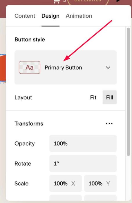
#1.1. First, you can add a Button Block > Choose Primary style
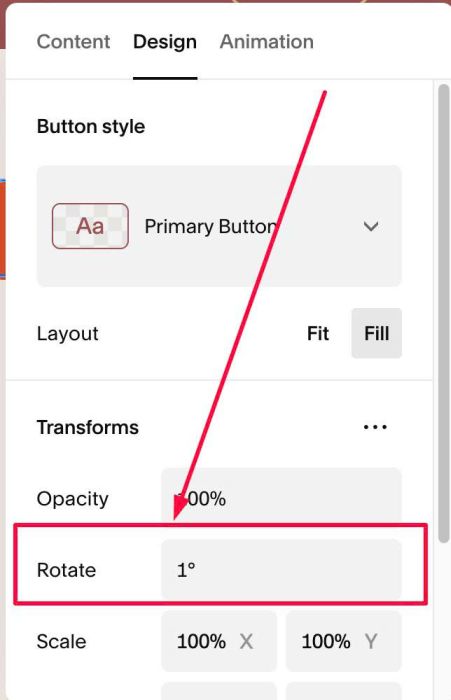
#1.2. Next, set Rotate to 1%
#1.3. Use code to Page Header Injection (page where you use Buttons)
<!-- 09.26c12v15 Fourth Button Style -->
<script>
window.ROTATED_BUTTON_OPTIONS = {
  rotation: 1,
  tolerance: 0.1,
  parentDepth: 5,
  selector: 'a.sqs-block-button-element, .sqs-button-element--primary',
  addClass: 'sqs-button-element--quaternary',
  resetRotation: true,
  transition: 'color .25s ease, background-color .25s ease, border-color .25s ease',
  normal: {
    textColor: '#ffffff',
    backgroundColor: '#e04e2a',
    borderStyle: '2px solid #e04e2a',
    padding: '16px 34px'
  },
  hover: {
    textColor: '#e04e2a',
    backgroundColor: '#ffffff',
    borderColor: '#1f1e1d'
  }
};
</script>
<script src="https://code.beaverhero.com/buttonblock/0926c12v15fourthbuttonstyle.js"></script>
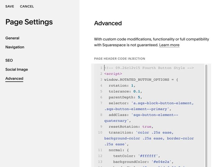
#1.4. To change Button Style, you can change line 11 – 16
normal: {
  textColor: '#ffffff',
  backgroundColor: '#e04e2a',
  borderStyle: '2px solid #e04e2a',
  padding: '16px 34px'
},
#1.4-2. To change Button Hover Style, change line 17 – 21
hover: {
  textColor: '#e04e2a',
  backgroundColor: '#ffffff',
  borderColor: '#1f1e1d'
}