Description
- Want a bento-style layout without a plugin? This CSS arranges 5 List Section items into a grid with one tall feature card, and reveals each item’s description when you hover over it
- view demo – password: abc
- buy me a coffee
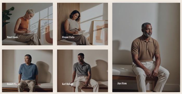
#1. Install Code
#1.1. First, add a Section > Choose Team > Choose Section with (i) icon

#1.2. Hover on top right of section > Click EDIT CONTENT
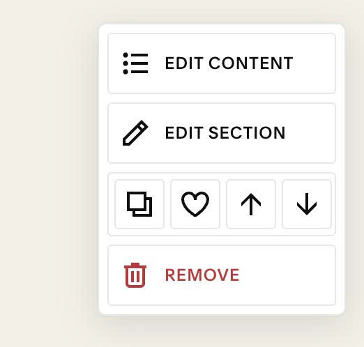
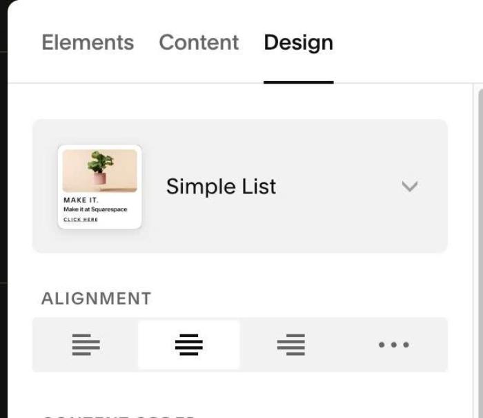
Choose Simple List
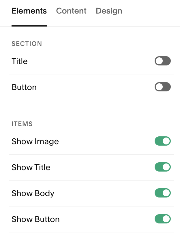
#1.3. Enable these options
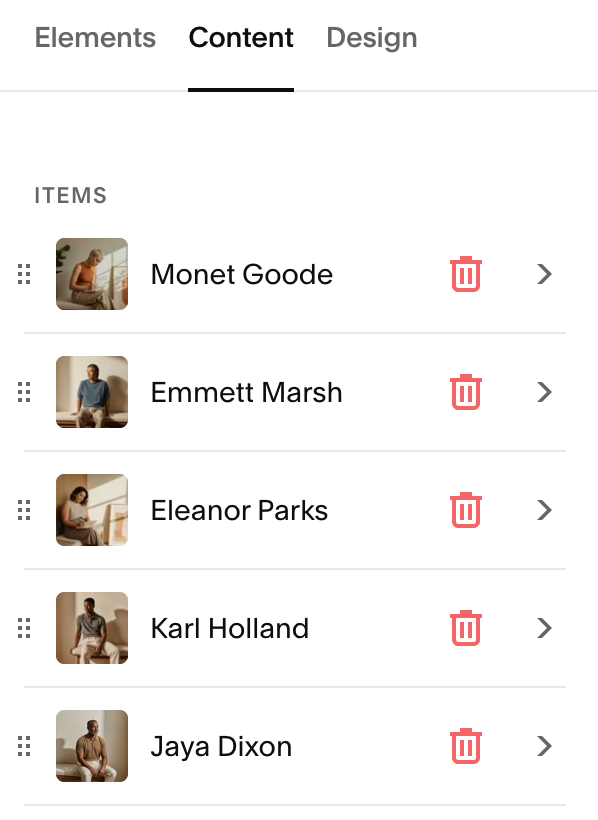
#1.4. at Content > Edit text (title, description, button url)
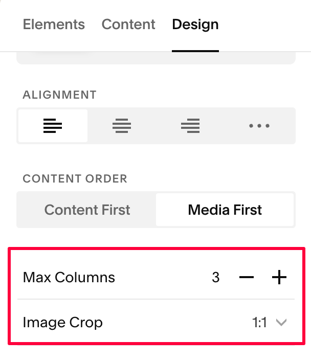
#1.5. Next, set 3 Columns + Image Crop: 1:1
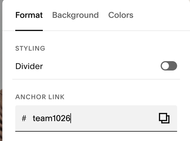
#1.6. Hover on top right of section > Click EDIT SECTION
#1.7. at Format > Anchor Link > enter word: team1026
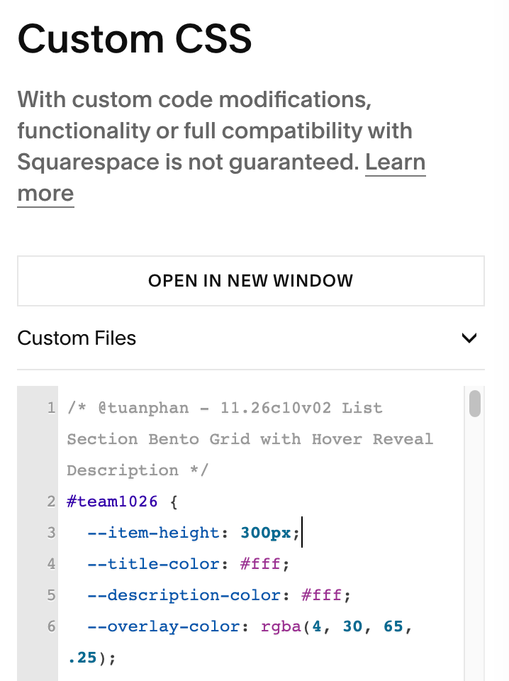
#1.8. Next, use this code to Custom CSS
/* @tuanphan - 11.26c10v02 List Section Bento Grid with Hover Reveal Description */
#team1026 {
  --item-height: 300px;
  --title-color: #fff;
  --description-color: #fff;
  --overlay-color: rgba(4, 30, 65, .25);
  --overlay-hover-color: rgba(4, 30, 65, .35);
  --grid-columns: 30fr 30fr 40fr;
  --item-shadow: 0 0 40px rgba(0, 0, 0, .1);
  --image-hover-transform: scale(1.2);

  .user-items-list-simple {
    grid-template-columns: var(--grid-columns);
    grid-template-rows: var(--item-height) var(--item-height);
    grid-auto-flow: column;
  }
  .user-items-list-simple .list-item {
    position: relative;
    overflow: hidden;
    width: auto;
    height: 100%;
    box-shadow: var(--item-shadow);
  }
  .user-items-list-simple .list-item:nth-child(5) {
    grid-row: span 2;
  }
  .list-item-media {
    position: absolute;
    inset: 0;
    width: 100%;
    height: 100%;
    margin: 0;
  }
  .list-item-media-inner {
    height: 100%;
    padding-bottom: 0 !important;
  }
  .list-item-media img {
    width: 100% !important;
    height: 100% !important;
    transition: transform .5s ease;
  }
  .list-item-media::after {
    content: "";
    position: absolute;
    inset: 0;
    background-color: var(--overlay-color);
    transition: background-color .5s ease;
  }
  .list-item-content {
    position: static;
    padding: 0;
  }
  .list-item-content__text-wrapper {
    position: absolute;
    left: 0;
    right: 0;
    bottom: 0;
    z-index: 1;
    padding: 35px;
    display: grid;
    grid-template-rows: auto 0fr;
    transition: grid-template-rows .5s ease;
  }
  .list-item-content__title {
    width: 100%;
    color: var(--title-color, var(--list-section-simple-title-color));
  }
  .list-item-content__description {
    width: 100%;
    min-height: 0;
    overflow: hidden;
  }
  .list-item-content__description,
  .list-item-content__description p {
    color: var(--description-color, var(--list-section-simple-description-color));
  }
  .list-item-content__button-wrapper {
    position: absolute;
    inset: 0;
    z-index: 2;
    margin: 0;
  }
  .list-item-content__button-container {
    position: static;
  }
  .list-item-content__button {
    position: absolute;
    inset: 0;
    opacity: 0;
  }
  .list-item:hover .list-item-media img {
    transform: var(--image-hover-transform);
  }
  .list-item:hover .list-item-media::after {
    background-color: var(--overlay-hover-color);
  }
  .list-item:hover .list-item-content__text-wrapper {
    grid-template-rows: auto 1fr;
  }

  @media (max-width: 767px) {
    .user-items-list-simple {
      grid-template-columns: 1fr;
      grid-template-rows: none;
      grid-auto-flow: row;
      grid-auto-rows: var(--item-height);
    }
    .user-items-list-simple .list-item:nth-child(5) {
      grid-row: auto;
    }
  }
}
#2. Customize
#2.1. By default, you can change Item Title, Item Description Color in Site Styles, but here I used code to override color, you can change it here
--title-color: #fff;
--description-color: #fff;
#2.2. To reduce height of small items, change this line. This also change height of longest item
--item-height: 300px;
#2.3. To change overlay color/hover color over image, change this
--overlay-color: rgba(4, 30, 65, .25);
  --overlay-hover-color: rgba(4, 30, 65, .35);
#2.4. To change zoom ratio, change this
--image-hover-transform: scale(1.2);
#2.5. Other
- space between items
- alignment (left, center, right)
- …
You can hover on top right of section > Click EDIT CONTENT > Edit it in Design > Style or Size & Space