Description
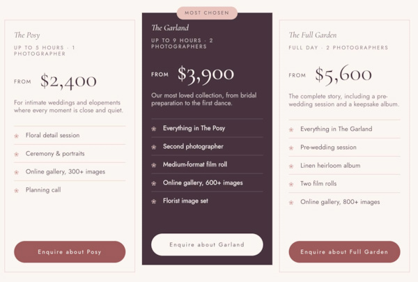
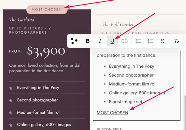
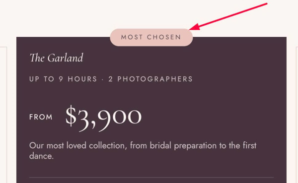
- Want pricing cards where the featured package stands out? Underline the last line (“Most Popular”) and this CSS raises that card, darkens it and adds a centered badge, while the other cards keep a light, outlined look.
- buy me a coffee
#1. Install Code
#1.1. Make sure you use List Simple
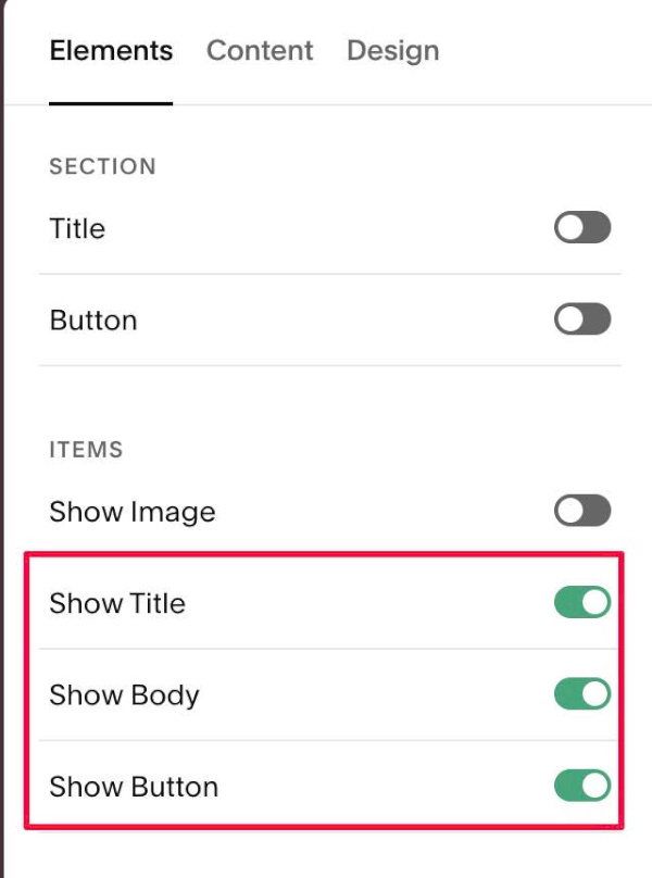
#1.2. Enable these options
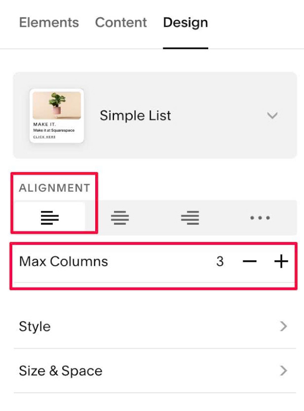
#1.3. Choose 3 Columns + Align: Left
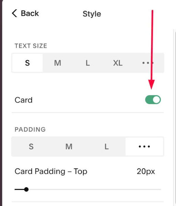
#1.3-2. at Style > Enable Card
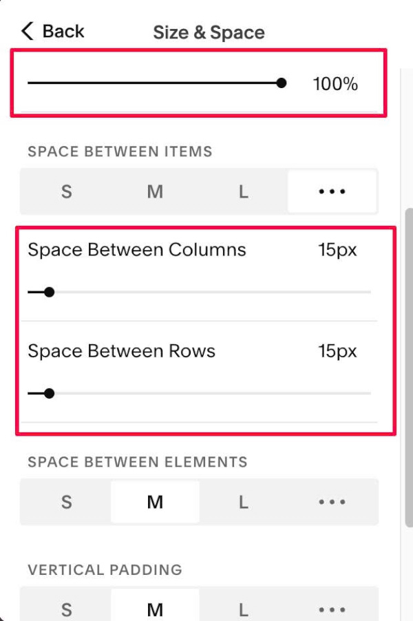
#1.3-3. at Size & Space > Set Content Width = 100%, change Rows, Columns Space
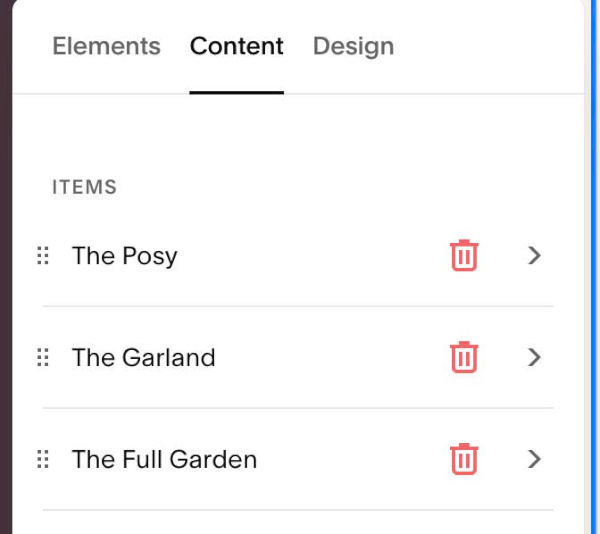
#1.4. Next, edit each item
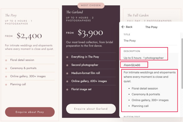
#1.4-2. Enter text like this
- Note: Use Strikethrough text = Pricing Text
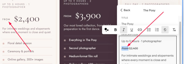
Use Italic text for word “From”
Use Underline text for Featured Label text
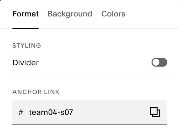
#1.5. Hover on top right of section > Click EDIT SECTION > at Format > Anchor Link > enter word: team04-s07
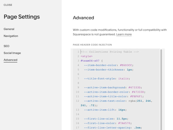
#1.6. Next, use this code to Page Header Injection
- If you need to tweak code with Personal/Basic Plan, comment below, I will give you new code.
- If you need a simpler approach to add Pricing Table, you can also use this plugin (affiliate link)
<style>
#team04-s07 {
  --item-border-color: #E6D3CC;
  --item-border-thickness: 1px;

  --title-font-style: italic;

  --active-item-background: #47333D;
  --active-item-border-color: #47333D;
  --active-item-title-color: #FBF6F1;
  --active-item-text-color: rgba(251, 246, 241, .72);
  --active-item-lift: 16px;

  --first-line-size: 11.5px;
  --first-line-color: #7A6570;
  --first-line-letter-spacing: .2em;
  --first-line-uppercase: uppercase;
  --first-line-space-above: 8px;
  --active-first-line-color: rgba(251, 246, 241, .72);

  --price-size: 52px;
  --price-color: #47333D;
  --price-font-family: var(--heading-font-font-family);
  --price-font-weight: 400;
  --price-space-above: 22px;
  --price-space-below: 18px;
  --active-price-color: #FBF6F1;

  --price-label-size: 12px;
  --price-label-font-family: var(--body-font-font-family);
  --price-label-letter-spacing: .14em;
  --price-label-space-right: 6px;

  --text-color: #7A6570;

  --list-space-above: 26px;
  --list-space-below: 34px;
  --list-icon: "\2740";
  --list-icon-size: 13px;
  --list-icon-color: #C98A86;
  --list-icon-text-gap: 13px;
  --list-line-color: #E6D3CC;
  --list-line-thickness: 1px;
  --list-text-line-space: 11px;
  --list-text-color: #47333D;
  --active-list-icon-color: #E8C4BD;
  --active-list-line-color: rgba(251, 246, 241, .16);
  --active-list-text-color: #FBF6F1;

  --label-background: #E8C4BD;
  --label-color: #47333D;
  --label-size: 10.5px;
  --label-letter-spacing: .22em;
  --label-padding: 7px 18px;
  --label-radius: 999px;

  --button-width: 100%;
  --button-radius: 999px;
  --button-padding: 15px 18px;
  --button-letter-spacing: .16em;
  --button-hover-background: #47333D;
  --button-hover-text-color: #FBF6F1;
  --button-hover-border-color: #47333D;
  --active-button-background: #FBF6F1;
  --active-button-text-color: #47333D;
  --active-button-border-color: #FBF6F1;
  --active-button-hover-background: #E8C4BD;
  --active-button-hover-text-color: #47333D;
  --active-button-hover-border-color: #E8C4BD;

  .user-items-list-simple {
    align-items: stretch;
  }

  .list-item {
    position: relative;
    overflow: visible;
    border: var(--item-border-thickness) solid var(--item-border-color);
    transition: transform .3s ease;
  }
  .list-item-content {
    display: flex;
    flex-direction: column;
    flex-grow: 1;
  }
  .list-item-content__text-wrapper {
    flex-grow: 1;
  }

  .list-item-content__title {
    font-style: var(--title-font-style);
  }

  .list-item-content__description {
    color: var(--text-color);
  }

  .list-item-content__description > p:first-child {
    margin: var(--first-line-space-above) 0 0;
    font-size: var(--first-line-size);
    letter-spacing: var(--first-line-letter-spacing);
    text-transform: var(--first-line-uppercase);
    color: var(--first-line-color);
  }

  .list-item-content__description > p:has(span[style*="line-through"]) {
    margin: var(--price-space-above) 0 var(--price-space-below);
    font-family: var(--price-font-family);
    font-size: var(--price-size);
    font-weight: var(--price-font-weight);
    line-height: 1;
    color: var(--price-color);
  }
  .list-item-content__description > p:has(span[style*="line-through"]) span {
    text-decoration: none !important;
  }
  .list-item-content__description > p:has(span[style*="line-through"]) em {
    margin-right: var(--price-label-space-right);
    font-family: var(--price-label-font-family);
    font-size: var(--price-label-size);
    font-style: normal;
    letter-spacing: var(--price-label-letter-spacing);
    text-transform: uppercase;
    vertical-align: middle;
  }

  .list-item-content__description > :has(+ ul) {
    margin-bottom: 0;
  }
  .list-item-content__description ul {
    margin: var(--list-space-above) 0 var(--list-space-below);
    padding: 0;
    list-style: none;
  }
  .list-item-content__description ul li {
    position: relative;
    margin: 0;
    padding: var(--list-text-line-space) 0 var(--list-text-line-space) calc(var(--list-icon-size) + var(--list-icon-text-gap));
    border-top: var(--list-line-thickness) solid var(--list-line-color);
    color: var(--list-text-color);
    list-style: none;
  }
  .list-item-content__description ul li > p {
    margin: 0;
  }
  .list-item-content__description ul li > p::before {
    content: none !important;
    display: none !important;
  }
  .list-item-content__description ul li::before {
    content: var(--list-icon);
    position: absolute;
    left: 0;
    top: var(--list-text-line-space);
    font-size: var(--list-icon-size);
    line-height: inherit;
    color: var(--list-icon-color);
  }

  .list-item-content__description > p:last-child:has(u) {
    position: absolute;
    top: 0;
    left: 50%;
    z-index: 1;
    margin: 0;
    padding: var(--label-padding);
    transform: translate(-50%, -50%);
    border-radius: var(--label-radius);
    background: var(--label-background);
    color: var(--label-color);
    font-size: var(--label-size);
    font-weight: 400;
    line-height: 1.4;
    letter-spacing: var(--label-letter-spacing);
    text-transform: uppercase;
    white-space: nowrap;
  }
  .list-item-content__description > p:last-child u {
    text-decoration: none;
  }

  .list-item-content__button-container {
    width: 100%;
  }
  .list-item-content__button {
    width: var(--button-width);
    max-width: 100%;
    box-sizing: border-box;
    padding: var(--button-padding) !important;
    border-radius: var(--button-radius) !important;
    letter-spacing: var(--button-letter-spacing) !important;
    text-align: center;
  }
  .list-item-content__button:hover {
    background-color: var(--button-hover-background) !important;
    color: var(--button-hover-text-color) !important;
    border-color: var(--button-hover-border-color) !important;
  }

  .list-item:has(.list-item-content__description > p:last-child u) {
    background-color: var(--active-item-background) !important;
    border-color: var(--active-item-border-color);

    .list-item-content__title {
      color: var(--active-item-title-color) !important;
    }
    .list-item-content__description {
      color: var(--active-item-text-color) !important;
    }
    .list-item-content__description > p:first-child {
      color: var(--active-first-line-color);
    }
    .list-item-content__description > p:has(span[style*="line-through"]) {
      color: var(--active-price-color);
    }
    .list-item-content__description ul li {
      border-top-color: var(--active-list-line-color);
      color: var(--active-list-text-color);
    }
    .list-item-content__description ul li::before {
      color: var(--active-list-icon-color);
    }
    .list-item-content__description > p:last-child:has(u) {
      color: var(--label-color) !important;
    }
    .list-item-content__button {
      background-color: var(--active-button-background) !important;
      color: var(--active-button-text-color) !important;
      border-color: var(--active-button-border-color) !important;
    }
    .list-item-content__button:hover {
      background-color: var(--active-button-hover-background) !important;
      color: var(--active-button-hover-text-color) !important;
      border-color: var(--active-button-hover-border-color) !important;
    }
  }

  @media (min-width: 768px) {
    .list-item:has(.list-item-content__description > p:last-child u) {
      transform: translateY(calc(var(--active-item-lift) * -1));
    }
  }
}
</style>
#1.7. Customize
To change Item Border, you can edit
--item-border-color: #E6D3CC;
 --item-border-thickness: 1px;
To change item background, change this
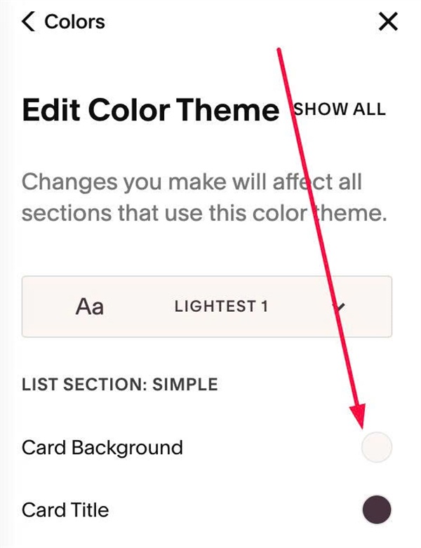
To change active item background/active item text, edit this
--active-item-background: #47333D;
--active-item-border-color: #47333D;
--active-item-title-color: #FBF6F1;
--active-item-text-color: rgba(251, 246, 241, .72);
--active-item-lift: 16px;
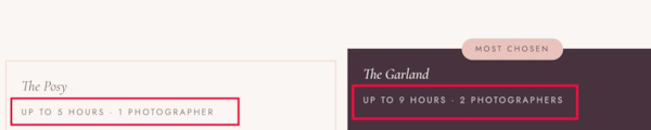
To change First Line in Item Description, edit this
--first-line-size: 11.5px;
--first-line-color: #7A6570;
--first-line-letter-spacing: .2em;
--first-line-uppercase: uppercase;
--first-line-space-above: 8px;
--active-first-line-color: rgba(251, 246, 241, .72);
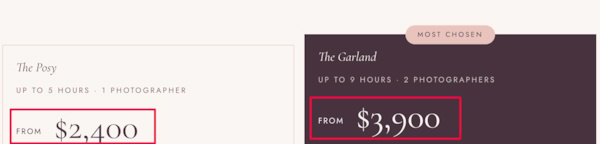
To change text From + Price style, edit this
--price-size: 52px;
--price-color: #47333D;
--price-font-family: var(--heading-font-font-family);
--price-font-weight: 400;
--price-space-above: 22px;
--price-space-below: 18px;
--active-price-color: #FBF6F1;

--price-label-size: 12px;
--price-label-font-family: var(--body-font-font-family);
--price-label-letter-spacing: .14em;
--price-label-space-right: 6px;
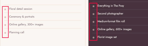
To change Icon in Unordered List, change this
--list-icon: "\2740";
  --list-icon-size: 13px;
  --list-icon-color: #C98A86;
  --list-icon-text-gap: 13px;
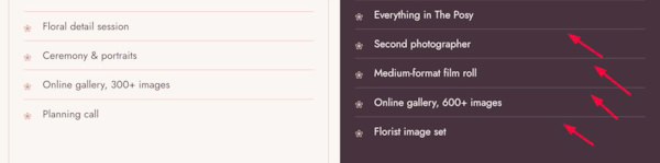
To change Line style in Unordered List, change this
--list-line-color: #E6D3CC;
--list-line-thickness: 1px;
--list-text-line-space: 11px;
--active-list-icon-color: #E8C4BD;
--active-list-line-color: rgba(251, 246, 241, .16);
To change featured label text style, edit this
--label-background: #E8C4BD;
--label-color: #47333D;
--label-size: 10.5px;
--label-letter-spacing: .22em;
--label-padding: 7px 18px;
--label-radius: 999px;
To change Button, Active Item Button text style, change this
--button-width: 100%;
--button-radius: 999px;
--button-padding: 15px 18px;
--button-letter-spacing: .16em;
--button-hover-background: #47333D;
--button-hover-text-color: #FBF6F1;
--button-hover-border-color: #47333D;
--active-button-background: #FBF6F1;
--active-button-text-color: #47333D;
--active-button-border-color: #FBF6F1;
--active-button-hover-background: #E8C4BD;
--active-button-hover-text-color: #47333D;
--active-button-hover-border-color: #E8C4BD;