Description
- featured carousel with title, 3 images (bigger image – smaller images), text over image, text under image, 2 buttons, use List Carousel
- view demo – password: abc
- buy me a coffee

1. Install Code
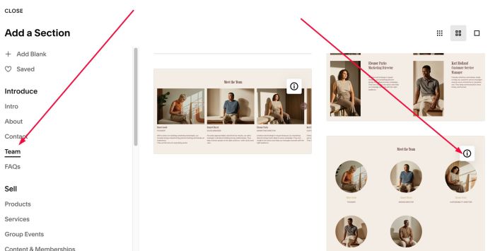
#1.1. First add Section > Choose Team > Choose Section with (i) icon
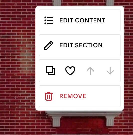
#1.2. Hover on top right of section > Click EDIT CONTENT
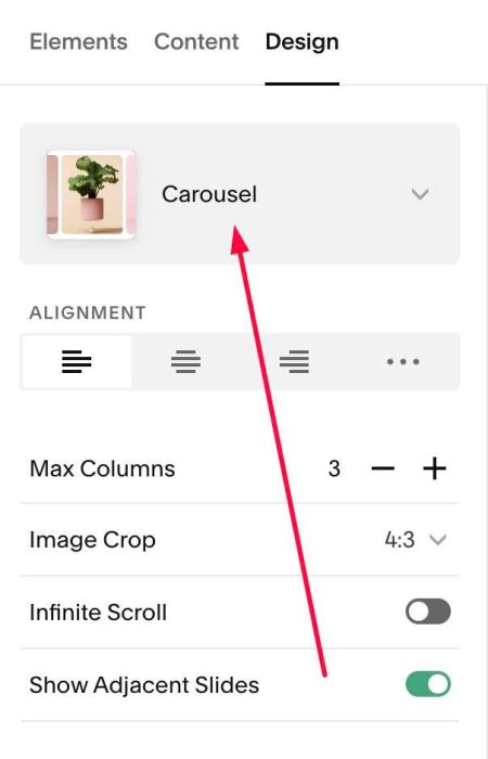
#1.3. at Design > Choose Carousel
#1.4. at Elements > You need to enable All options
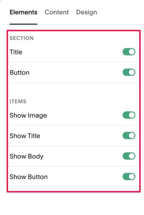
#1.5. at Content > Add your desired title, image, button url
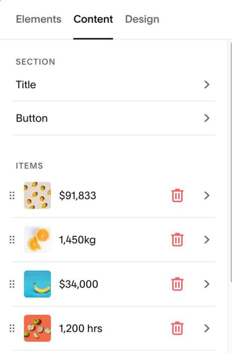
#1.5-1. Click on Section Title
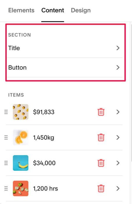
Enter desired Title + a hyperlink text

We will use hyperlink for button under Carousel
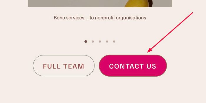
#1.5-2. Next, click on Section Button
Enter your desired button text/url
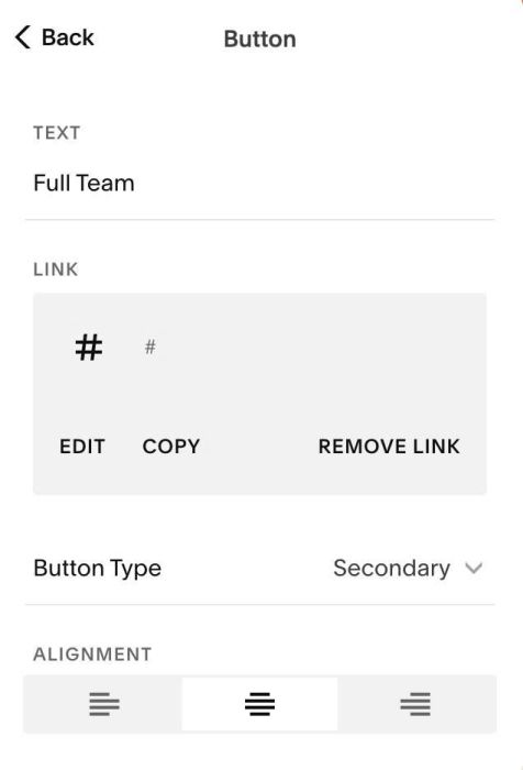
It will be this button

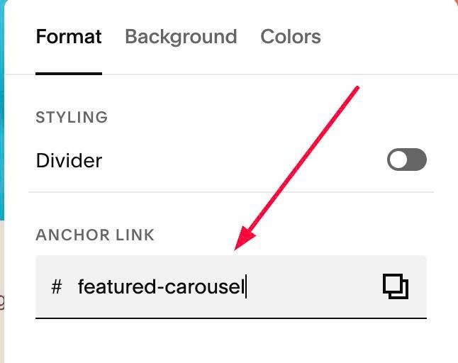
#1.6. Hover on top right of Carousel Section > Click EDIT SECTION > at Format > Anchor Link, enter word: featured-carousel
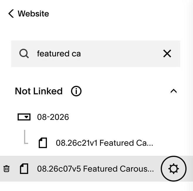
#1.7. Hover on Page where you use Carousel > Click Gear icon
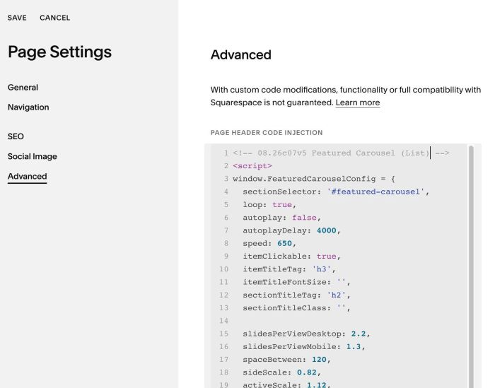
#1.8. Click Advanced > Paste this code
- If you use Personal/Basic Plan and your plan doesn’t support Injection, see #3.1
<!-- 08.26c07v5 Featured Carousel -->
<script>
window.FeaturedCarouselConfig = {
  sectionSelector: '#featured-carousel',
  loop: true,
  autoplay: false,
  autoplayDelay: 4000,
  speed: 650,
  itemClickable: true,
  itemTitleTag: 'h3',
  itemTitleFontSize: '',
  sectionTitleTag: 'h2',
  sectionTitleClass: '',

  slidesPerViewDesktop: 2.2,
  slidesPerViewMobile: 1.3,
  spaceBetween: 120,
  sideScale: 0.82,
  activeScale: 1.12,
  imageAspectRatio: '',
  imageOverlay: 'rgba(0,0,0,0.25)',

  titleColor: '#F2E1F2',
  descriptionColor: '',
  descriptionPClass: '',

  arrowEdgeGap: '2vw',
  arrowSize: '34px',
  arrowBgColor: '#111111',
  arrowBgHoverColor: '#000000',
  arrowIconColor: '#ffffff',
  arrowIconHoverColor: '#ffffff',

  dotSize: '7px',
  dotColor: '',
  dotActiveColor: '',
  dotHoverColor: '',

  button1Background: 'transparent',
  button1TextColor: '',
  button1BorderColor: 'rgba(0,0,0,0.5)',
  button1HoverBackground: 'var(--tertiaryButtonBackgroundColor)',
  button1HoverTextColor: 'var(--tertiaryButtonTextColor)',
  button1HoverBorderColor: '',

  button2Background: '#da0766',
  button2TextColor: '#ffffff',
  button2BorderColor: '',
  button2HoverBackground: '',
  button2HoverTextColor: '',
  button2HoverBorderColor: '',
};
</script>
<script src="https://code.beaverhero.com/listcarousel/0826c07v5featuredcarousellist.js"></script>
#2. Customize
#2.1. To change Title style

you can change line 12, 13
- h1 = h1 style
- h2 = h2 style
- h3 = h3 style
- h4 = h4 style
- p = paragraph style
sectionTitleTag: 'h2',
sectionTitleClass: '',
- if you use p
- then use sqsrte-large or sqsrte-small in sectionTitleClass (sqsrte-large = P1, sqsrte-small = P3)
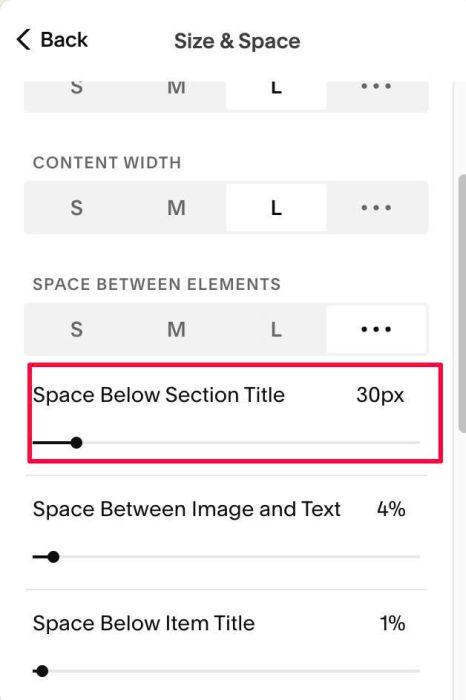
#2.2. To change space between Title

You can change this option
#2.3. To change Image Size & space between Images, you can change line 15 – 19
slidesPerViewDesktop: 2.2,
slidesPerViewMobile: 1.3,
spaceBetween: 120,
sideScale: 0.82,
activeScale: 1.12,
#2.4. To change overlay color over image, change line 21
imageOverlay: 'rgba(0,0,0,0.25)',
#2.5. To change item title over image, you can change line 10, 11
itemTitleTag: 'h3',
itemTitleFontSize: '',
and to change title color, change line 23
titleColor: '#F2E1F2',
If you want to make title inherit this color option
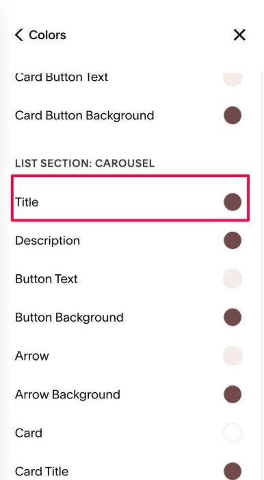
You can change line 23 to this
titleColor: '',
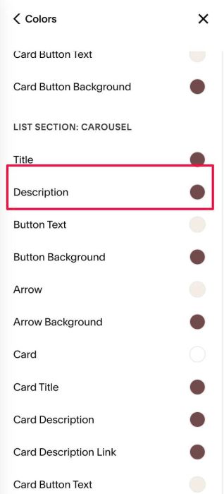
#2.6. To change text style under image, you can change line 24, 25
descriptionColor: '',
descriptionPClass: '',
to set it P3 style, change to this
descriptionColor: '',
descriptionPClass: 'sqsrte-small',
if P1 style, change to this
descriptionColor: '',
descriptionPClass: 'sqsrte-large',
Note: If you don’t set this text color, it will inherit color from this option
#2.7. To change Buttons style, change line 39 – 51
button1Background: 'transparent',
button1TextColor: '',
button1BorderColor: 'rgba(0,0,0,0.5)',
button1HoverBackground: 'var(--tertiaryButtonBackgroundColor)',
button1HoverTextColor: 'var(--tertiaryButtonTextColor)',
button1HoverBorderColor: '',

button2Background: '#da0766',
button2TextColor: '#ffffff',
button2BorderColor: '',
button2HoverBackground: '',
button2HoverTextColor: '',
button2HoverBorderColor: '',
#2.8. To change arrows – dots navigation style, change line 27 – 37
arrowEdgeGap: '2vw',
  arrowSize: '34px',
  arrowBgColor: '#111111',
  arrowBgHoverColor: '#000000',
  arrowIconColor: '#ffffff',
  arrowIconHoverColor: '#ffffff',

  dotSize: '7px',
  dotColor: '',
  dotActiveColor: '',
  dotHoverColor: '',
#2.9. If you need to tweak more you can use this AI Assistant (designed for Squarespace sites)
#3. Other
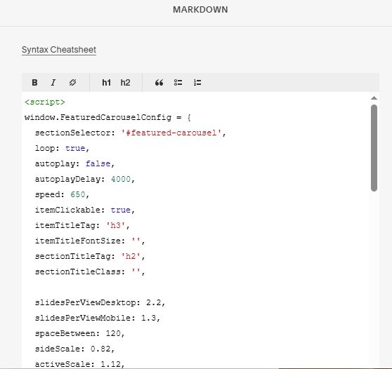
#3.1. If you use Personal/Basic Plan and your plan doesn’t support Injection, you can edit current page (page where you use Carousel) > Add a Block > Choose Markdown
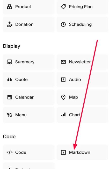
Add this code into Markdown
<script>
window.FeaturedCarouselConfig = {
  sectionSelector: '#featured-carousel',
  loop: true,
  autoplay: false,
  autoplayDelay: 4000,
  speed: 650,
  itemClickable: true,
  itemTitleTag: 'h3',
  itemTitleFontSize: '',
  sectionTitleTag: 'h2',
  sectionTitleClass: '',

  slidesPerViewDesktop: 2.2,
  slidesPerViewMobile: 1.3,
  spaceBetween: 120,
  sideScale: 0.82,
  activeScale: 1.12,
  imageAspectRatio: '',
  imageOverlay: 'rgba(0,0,0,0.25)',

  titleColor: '#F2E1F2',
  descriptionColor: '',
  descriptionPClass: '',

  arrowEdgeGap: '2vw',
  arrowSize: '34px',
  arrowBgColor: '#111111',
  arrowBgHoverColor: '#000000',
  arrowIconColor: '#ffffff',
  arrowIconHoverColor: '#ffffff',

  dotSize: '7px',
  dotColor: '',
  dotActiveColor: '',
  dotHoverColor: '',

  button1Background: 'transparent',
  button1TextColor: '',
  button1BorderColor: 'rgba(0,0,0,0.5)',
  button1HoverBackground: 'var(--tertiaryButtonBackgroundColor)',
  button1HoverTextColor: 'var(--tertiaryButtonTextColor)',
  button1HoverBorderColor: '',

  button2Background: '#da0766',
  button2TextColor: '#ffffff',
  button2BorderColor: '',
  button2HoverBackground: '',
  button2HoverTextColor: '',
  button2HoverBorderColor: '',
};
</script>
<script src="https://code.beaverhero.com/listcarousel/0826c07v5featuredcarousellist.js"></script>