Description
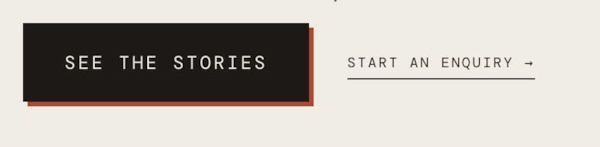
- Want a primary button and a quieter secondary link next to each other? Put both links in one Paragraph 3 line and this CSS styles the first as a solid button with an offset shadow hover, and the second as an underlined link.
- buy me a coffee
#1. Install Code
#1.1. First, make sure you use Paragraph 3
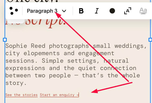
#1.2. Enter 2 desired links
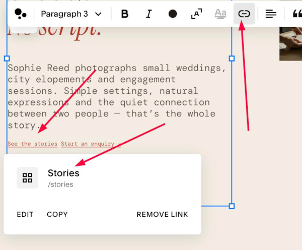
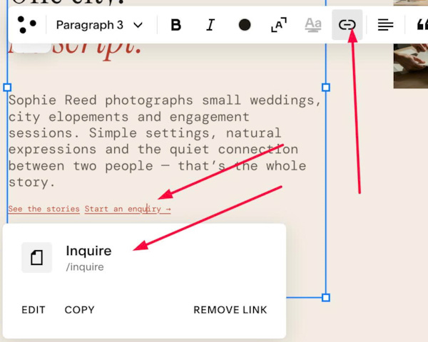
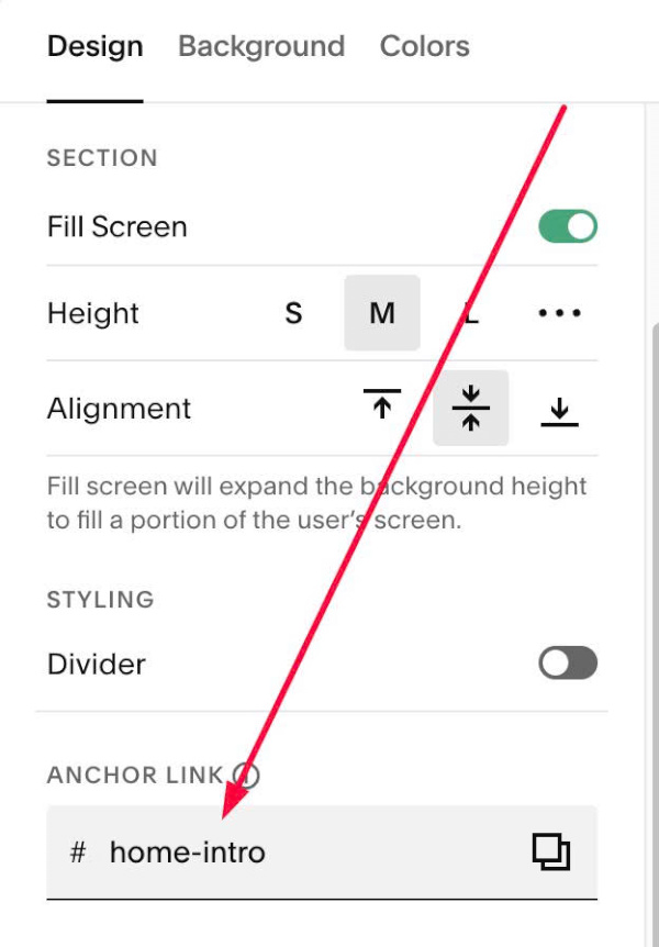
#1.3. Hover on top right of section > Click EDIT SECTION > at Design > Anchor Link > Enter word: home-intro
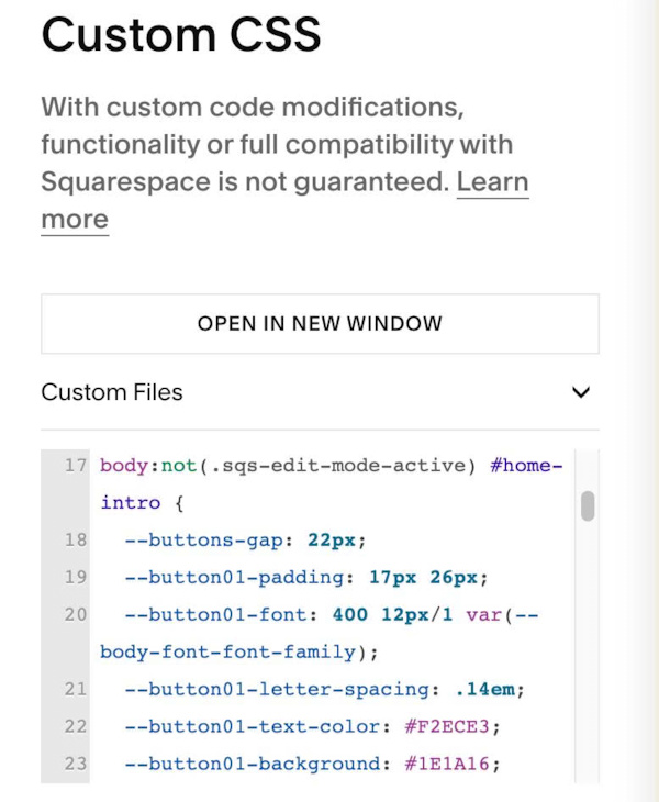
#1.4. Next, use this code to Custom CSS
body:not(.sqs-edit-mode-active) #home-intro {
  --buttons-gap: 22px;
  --button01-padding: 17px 26px;
  --button01-font: 400 12px/1 var(--body-font-font-family);
  --button01-letter-spacing: .14em;
  --button01-text-color: #F2ECE3;
  --button01-background: #1E1A16;
  --button01-border-color: #1E1A16;
  --button01-hover-shadow-color: #BC3E2B;
  --button02-padding: 0 0 4px;
  --list-font: ~"400 var(--list-font-size)/1.6 var(--body-font-font-family)";
  --button02-letter-spacing: .14em;
  --button02-text-color: #1E1A16;
  --button02-hover-text-color: #BC3E2B;
  .sqs-html-content p.sqsrte-small:has(> a + a) {
    display: flex;
    flex-wrap: wrap;
    align-items: center;
    gap: var(--buttons-gap);
    font-size: 0;
    > a:nth-of-type(1) {
      display: inline-flex;
      align-items: center;
      justify-content: center;
      padding: var(--button01-padding);
      border: 1px solid var(--button01-border-color);
      border-radius: 0;
      background: var(--button01-background);
      color: var(--button01-text-color);
      font: var(--button01-font);
      letter-spacing: var(--button01-letter-spacing);
      text-transform: uppercase;
      text-decoration: none;
      opacity: 1;
      transition: transform .25s, box-shadow .25s;
      &:hover {
        color: var(--button01-text-color);
        opacity: 1;
        transform: translate(-3px, -3px);
        box-shadow: 3px 3px 0 var(--button01-hover-shadow-color);
      }
    }
    > a:nth-of-type(2) {
      display: inline-flex;
      padding: var(--button02-padding);
      border: 0;
      border-bottom: 1px solid currentColor;
      background: none;
      color: var(--button02-text-color);
      font: var(--button02-font);
      letter-spacing: var(--button02-letter-spacing);
      text-transform: uppercase;
      text-decoration: none;
      opacity: 1;
      transition: color .2s;
      &:hover {
        color: var(--button02-hover-text-color);
        opacity: 1;
      }
    }
  }
}
#1.5. Customize
To change gap between 2 buttons, edit this
--buttons-gap: 22px;
To change Left Button Size, edit this
--button01-padding: 17px 26px;
To change Left Button Style/Color, edit this
--button01-font: 400 12px/1 var(--body-font-font-family);
  --button01-letter-spacing: .14em;
  --button01-text-color: #F2ECE3;
  --button01-background: #1E1A16;
  --button01-border-color: #1E1A16;
  --button01-hover-shadow-color: #BC3E2B;
To change Right Button Style (text with arrow), edit this
--button02-padding: 0 0 4px;
  --button02-font: 400 12px/1.3 var(--body-font-font-family);
  --button02-letter-spacing: .14em;
  --button02-text-color: #1E1A16;
  --button02-hover-text-color: #BC3E2B;