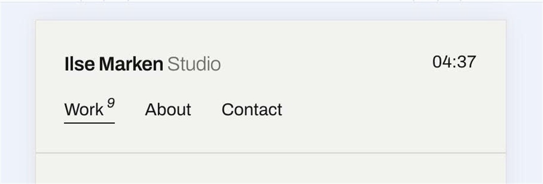
Squarespace mobile headers hide the navigation behind a burger button. This code shows your menu links in a row right under the site title and adds a live clock with the local time of any city you choose on the right side of the header.
#1. Install Code
#1.1. First, you can follow this instructions to add Live Local Clock
#1.2. Next, use this code to Custom CSS
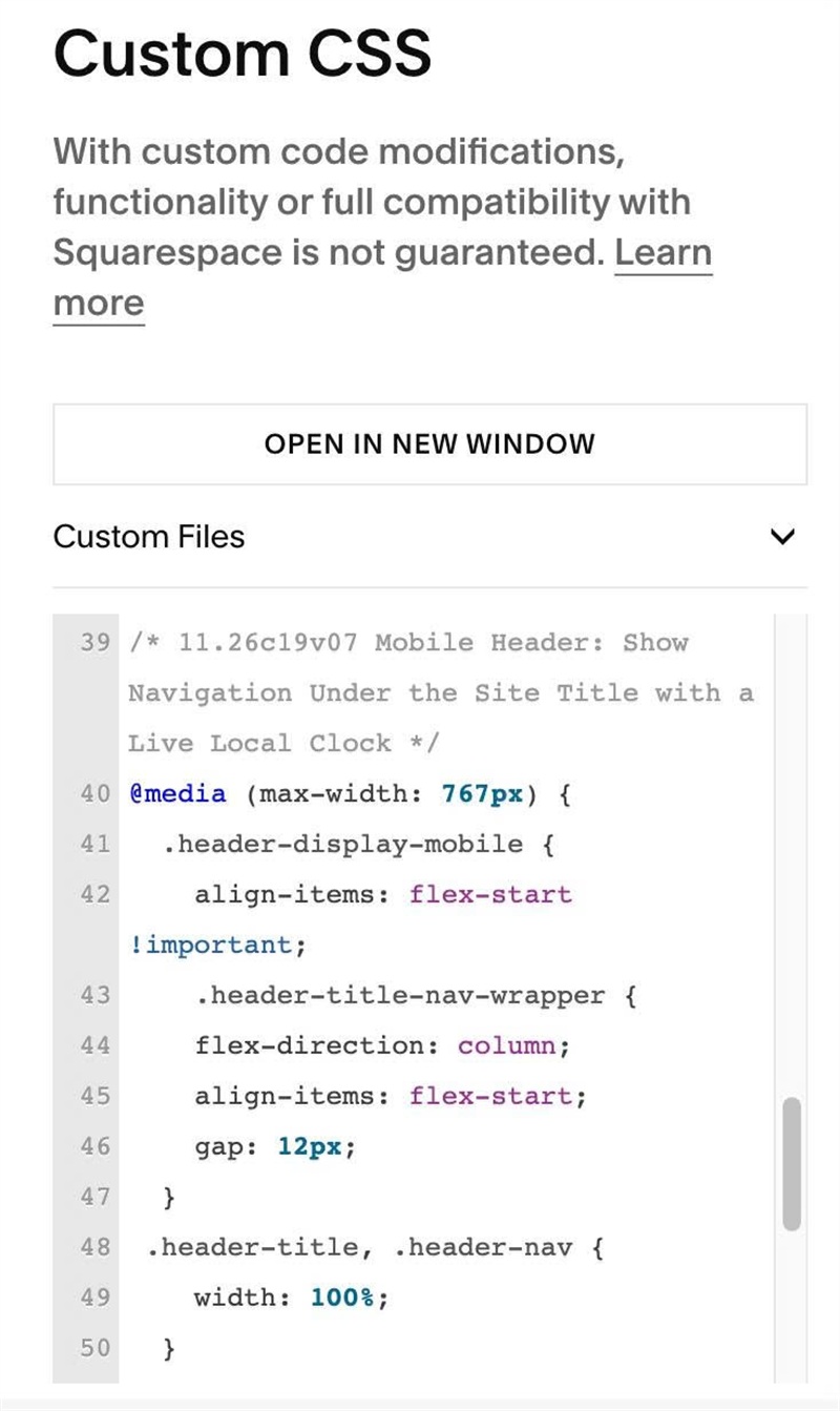
/* 11.26c19v07 Mobile Header: Show Navigation Under the Site Title with a Live Local Clock */
@media (max-width: 767px) {
  .header-display-mobile {
    align-items: flex-start !important;
    .header-title-nav-wrapper {
    flex-direction: column;
    align-items: flex-start;
    gap: 12px;
  }
 .header-title, .header-nav {
    width: 100%;
  }
.header-nav {
    display: block !important;
  }
.header-nav-list {
    display: flex;
    justify-content: flex-start;
    gap: 15px;
  }
.header-nav-item:first-child {
    margin-left: 0;
  }
    .header-burger {
      display: none;
    }
  }}
#1.3. Customize
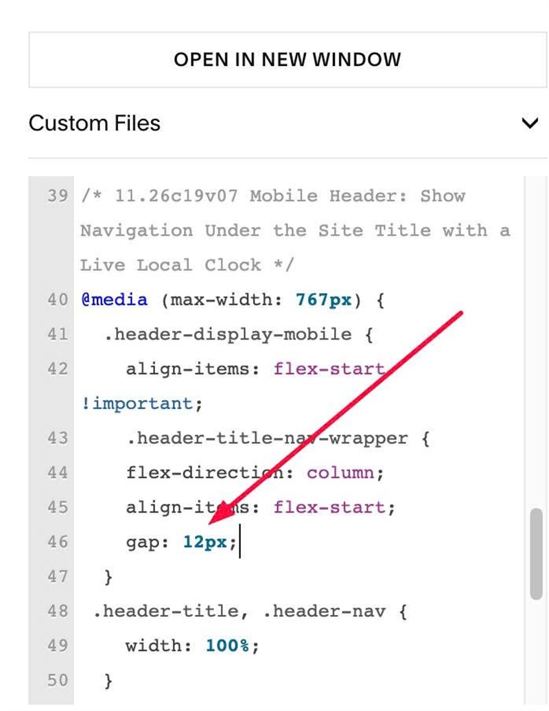
To change gap between Site Title/Logo – Navigation Links, change line
gap: 12px;
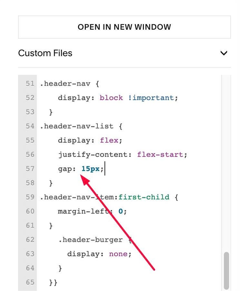
To change gap between Navigation Links on Mobile, change line
gap: 15px;