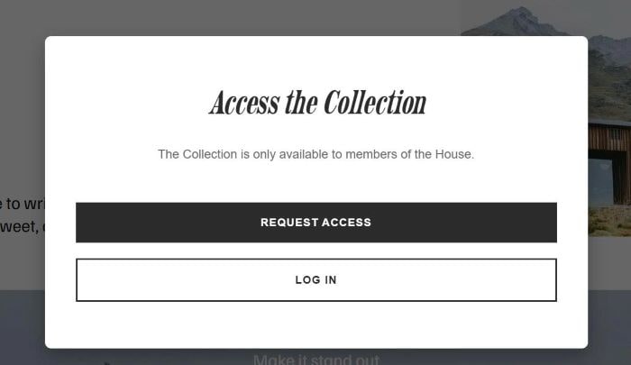
To make a popup always appear without closing it, like this.
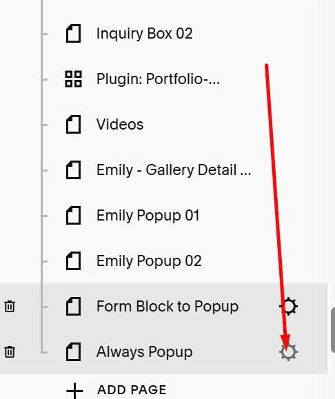
#1. Hover on Page > Click Gear icon
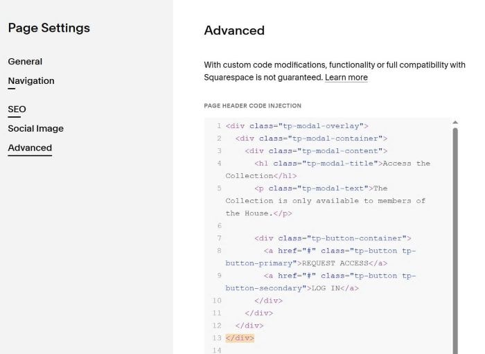
#2. Click Advanced > Paste code to right box
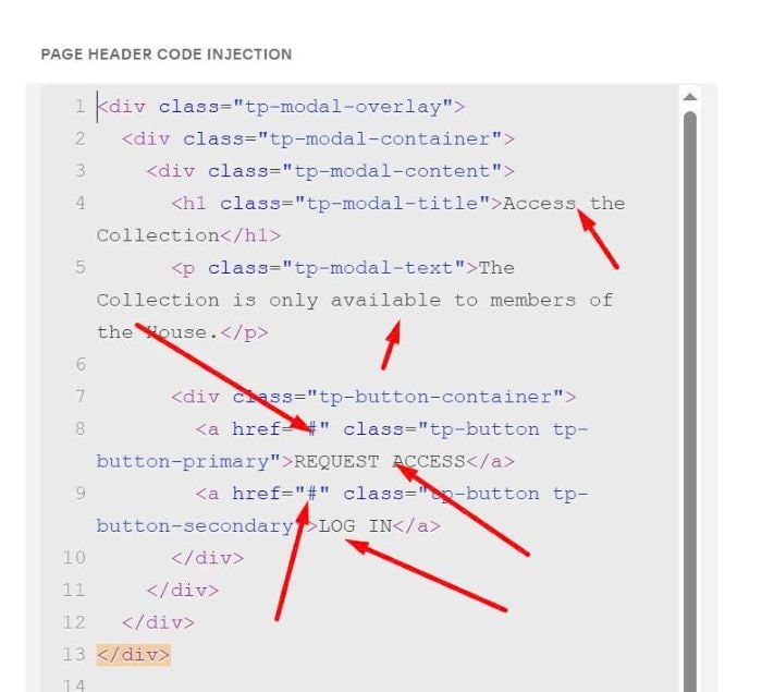
<div class="tp-modal-overlay">
<div class="tp-modal-container">
<div class="tp-modal-content">
<h1 class="tp-modal-title">Access the Collection</h1>
<p class="tp-modal-text">The Collection is only available to members of the House.</p>
<div class="tp-button-container">
<a href="#" class="tp-button tp-button-primary">REQUEST ACCESS</a>
<a href="#" class="tp-button tp-button-secondary">LOG IN</a>
</div>
</div>
</div>
</div>
<style>
.tp-modal-overlay {
position: fixed;
top: 0;
left: 0;
width: 100%;
height: 100%;
background: rgba(0, 0, 0, 0.6);
display: flex;
justify-content: center;
align-items: center;
padding: 20px;
box-sizing: border-box;
z-index: 99999;
}
.tp-modal-container {
background: #ffffff;
border-radius: 8px;
max-width: 700px;
width: 100%;
max-height: 90vh;
overflow-y: auto;
box-shadow: 0 10px 25px rgba(0, 0, 0, 0.3);
}
.tp-modal-content {
padding: 60px 40px;
text-align: center;
}
.tp-modal-title {
font-size: 42px;
font-style: italic;
color: #2c2c2c;
margin: 0 0 30px 0;
font-weight: normal;
line-height: 1.2;
}
.tp-modal-text {
font-size: 16px;
color: #666666;
margin: 0 0 50px 0;
line-height: 1.5;
}
.tp-button-container {
display: flex;
flex-direction: column;
gap: 15px;
}
.tp-button {
padding: 18px 30px;
font-size: 14px;
font-weight: bold;
text-transform: uppercase;
letter-spacing: 1px;
cursor: pointer;
transition: all 0.3s ease;
text-decoration: none;
display: block;
text-align: center;
box-sizing: border-box;
width: 100%;
}
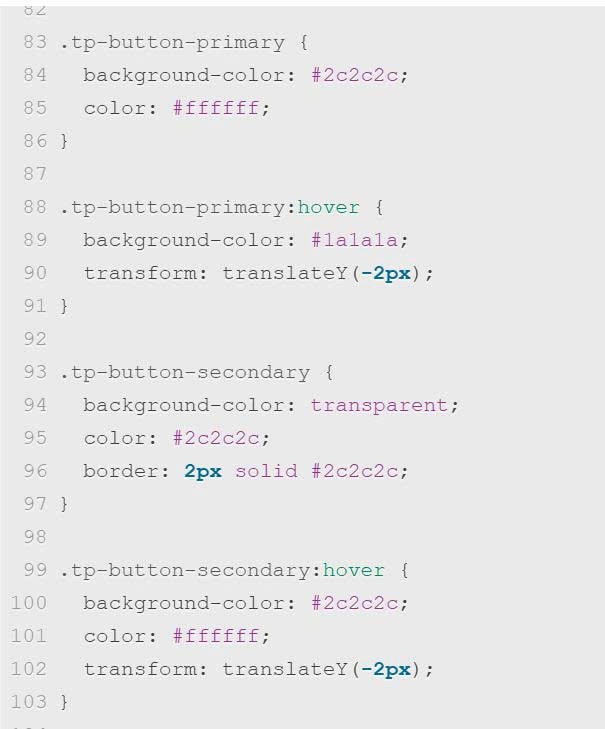
.tp-button-primary {
background-color: #2c2c2c;
color: #ffffff;
}
.tp-button-primary:hover {
background-color: #1a1a1a;
transform: translateY(-2px);
}
.tp-button-secondary {
background-color: transparent;
color: #2c2c2c;
border: 2px solid #2c2c2c;
}
.tp-button-secondary:hover {
background-color: #2c2c2c;
color: #ffffff;
transform: translateY(-2px);
}
@media (max-width: 767px) {
.tp-modal-content {
padding: 40px 25px;
}
.tp-modal-title {
font-size: 32px;
margin-bottom: 25px;
}
.tp-modal-text {
font-size: 15px;
margin-bottom: 40px;
}
.tp-button {
padding: 16px 25px;
font-size: 13px;
}
}
@media (min-width: 768px) {
.tp-button-container {
flex-direction: column;
gap: 20px;
}
}
</style>
#3. To change popup text, button url, you can change these.
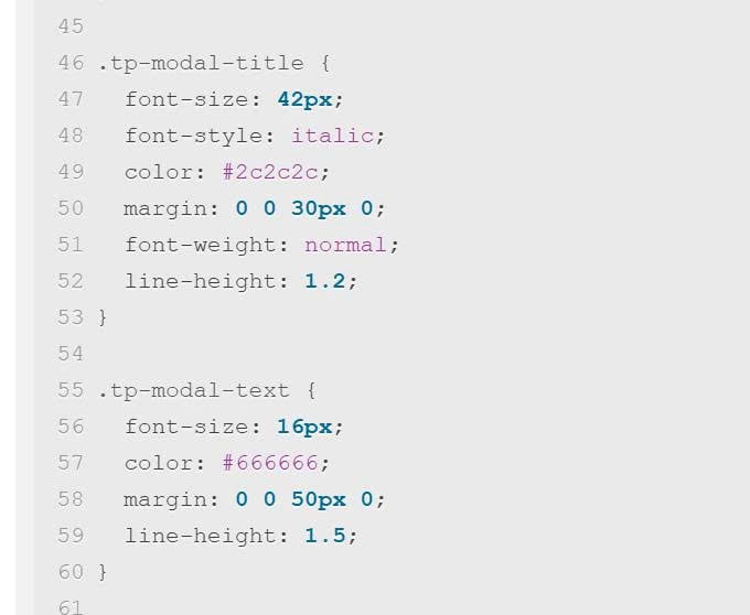
To change text size, change these.
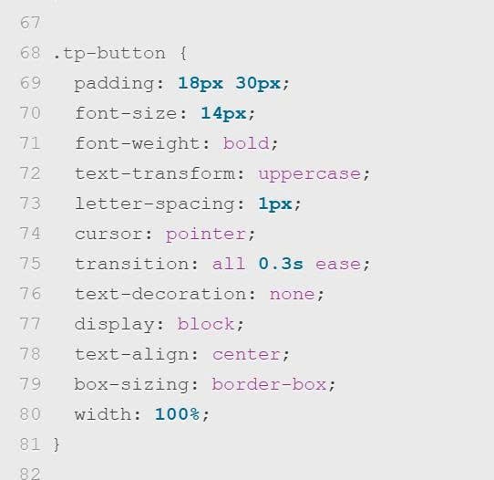
To change button style, change these.
To change button/button hover color, change this