Description
- adding custom top bar on top of site (v2)
- view demo – password: abc
- buy me a coffee
#1. Install Code
Note: This code require to use Section Loader Supreme Plugin
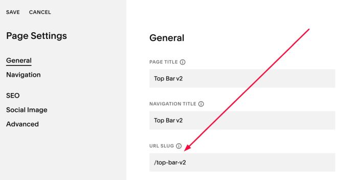
#1.1. First, add a Page in Not Linked with Name/URL:
- Name: Top Bar
- URL: /top-bar-v2
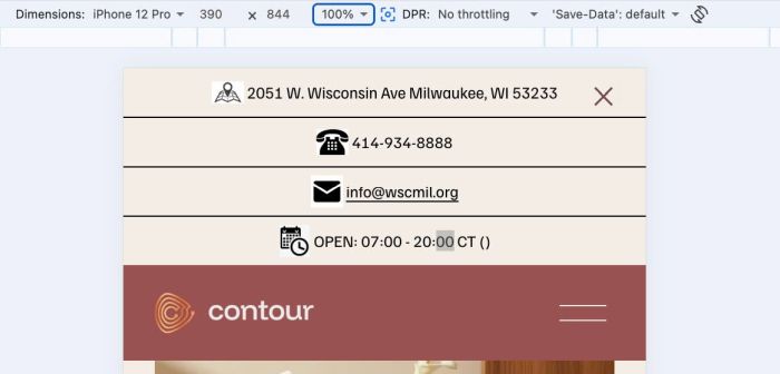
#1.2. Design your desired content. We will use content on this page as Top Bar content
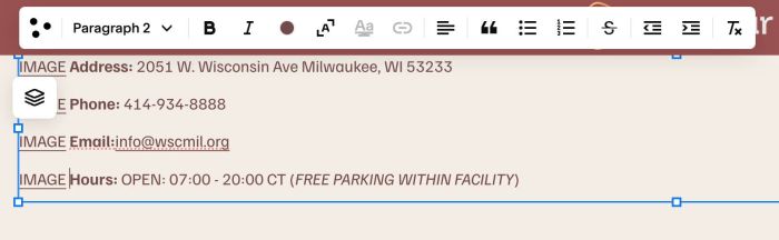
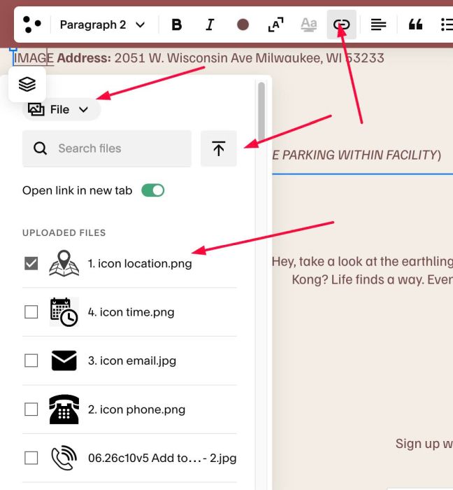
To add Icon before text, we will add text IMAGE > Then highlight it > Upload your desired icon
You can set Minimum Height to prevent any padding appears on top/bottom of top bar
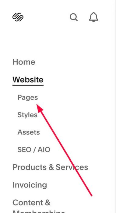
#1.3. Click Website > Pages
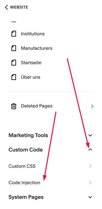
Scroll down to bottom > Click Custom Code > Code Injection
- If you use Personal/Basic Plan and your site doesn’t support Injection, see #3.1
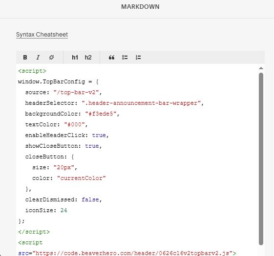
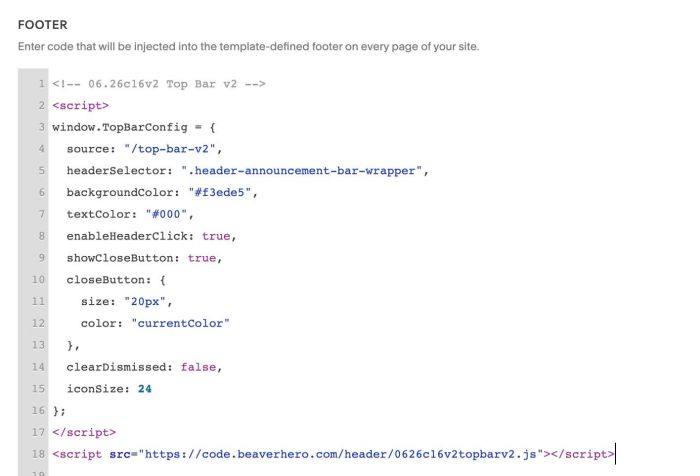
#1.4. Paste this code to Footer box
- If you use Personal/Basic Plan and your site doesn’t support Injection, see #3.1
<!-- 06.26c16v2 Top Bar v2 -->
<script>
window.TopBarConfig = {
  source: "/top-bar-v2",
  headerSelector: ".header-announcement-bar-wrapper",
  backgroundColor: "#f3ede5",
  textColor: "#000",
  enableHeaderClick: true,
  showCloseButton: true,
  closeButton: {
    size: "20px",
    color: "currentColor"
  },
  clearDismissed: false,
  iconSize: 24
};
</script>
<script src="https://code.beaverhero.com/header/0626c16v2topbarv2.js"></script>
#2. Customize
#2.1. Top change top bar background/text color, change Line 06, Line 07
backgroundColor: "#f3ede5",
textColor: "#000",
#2.2. To change X icon size/color, change Line 10 to Line 13
closeButton: {
  size: "20px",
  color: "currentColor"
},
to something like this
closeButton: {
  size: "30px",
  color: "#f1f"
},
#2.3. To style top bar like this
You can use this code to Custom CSS
div#wm-top-bar {
   --topbar-text-size: 12px;
   --topbar-image-top-space: 6px;
   --topbar-border-color: #000;
   li p:before {
      display: none;
   }
   ul {
      padding: 0px !important;
      display: flex;
      justify-content: space-between;
   }
   li {
      flex: 1;
      text-align: center;
      font-size: var(--topbar-text-size);
   }
   li p {
      display: flex;
      align-items: center;
      justify-content: center;
   }
   li:not(:last-child) {
      border-right: 1px solid var(--topbar-border-color);
   }
   .fluid-engine {
      display: block;
   }
   @media screen and (max-width:767px) {
      ul {
         flex-wrap: wrap !important;
         gap: 0px;
      }
      ul li {
         width: 100% !important;
         flex: unset;
         border: none !important;
      }
      ul li:not(:last-child) {
         border-bottom: 1px solid var(--topbar-border-color) !important;
      }
   }
   button#wm-top-bar-close {
      top: 20px !important;
   }
}
#2.4. To change close icon position, use this to Custom CSS
header#header #wm-top-bar button#wm-top-bar-close {
    top: 0px !important;
    right: 0px !important;
    padding: 0px !important;
    transform: unset !important;
    bottom: unset !important;
}
#2.5. To hide Close X icon, change Line 09
showCloseButton: true,
to
showCloseButton: false,
#3. Other
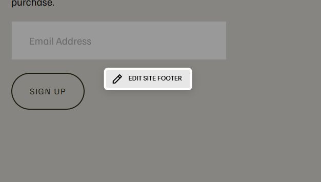
#3.1. If you use Personal/Basic Plan and your plan doesn’t support Injection, you can edit Site Footer
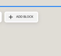
Add a Block
Choose Markdown
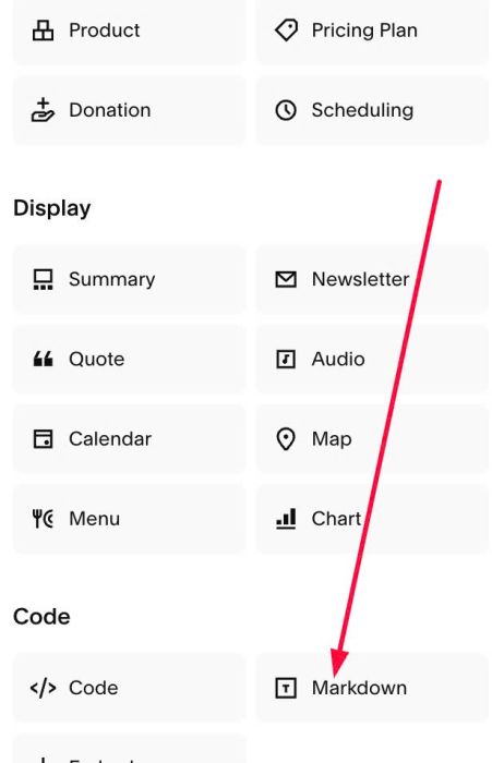
Paste this code into Markdown
<script>
window.TopBarConfig = {
  source: "/top-bar-v2",
  headerSelector: ".header-announcement-bar-wrapper",
  backgroundColor: "#f3ede5",
  textColor: "#000",
  enableHeaderClick: true,
  showCloseButton: true,
  closeButton: {
    size: "20px",
    color: "currentColor"
  },
  clearDismissed: false,
  iconSize: 24
};
</script>
<script src="https://code.beaverhero.com/header/0626c16v2topbarv2.js"></script>