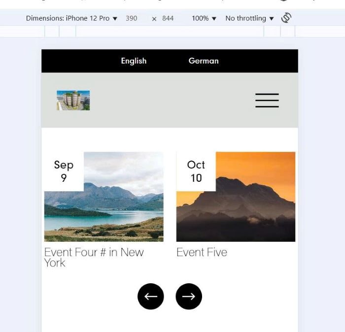
To turn Event Calendar to Carousel on Mobile, you can follow these.
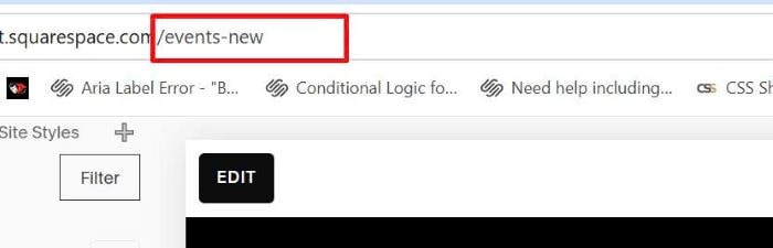
#1. First, find Event Page URL
In my example, it is: /events-new
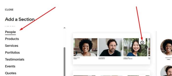
#2. Next, add a List People Carousel under Event Calendar
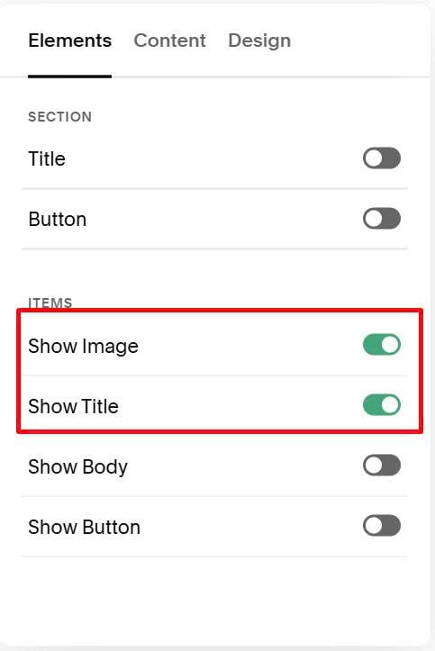
#3. Enable Title, Image Only
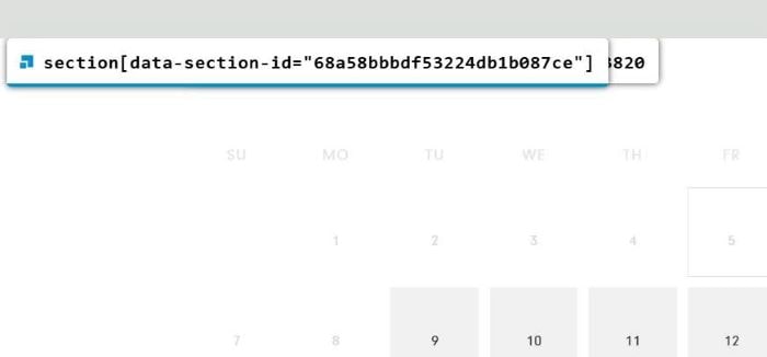
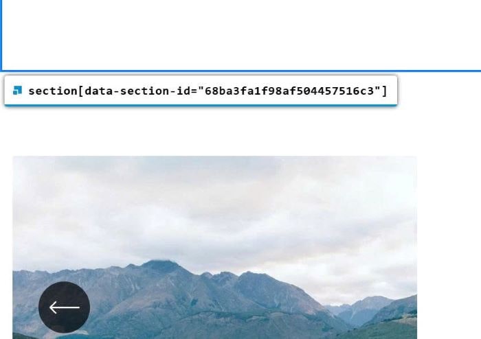
#4. Next, find ID of Event Calendar Section + Carousel Section
Event Calendar
Carousel Section
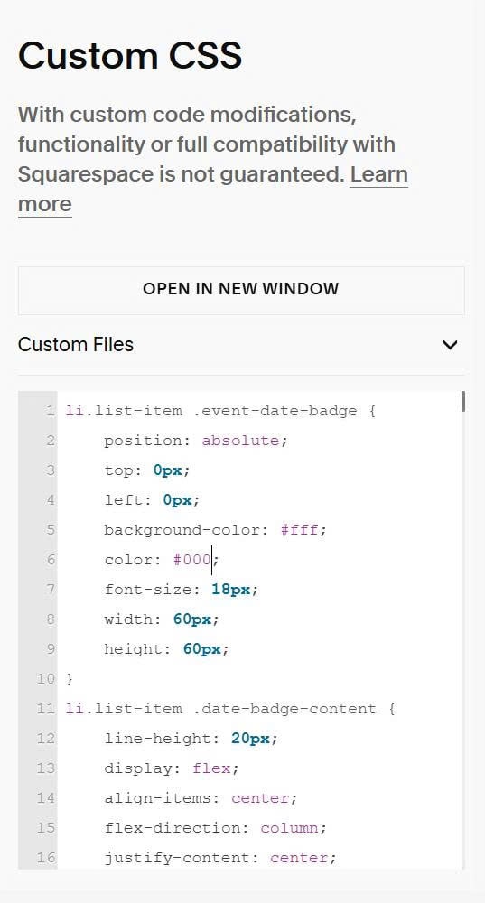
#5. Use this code to Custom CSS
li.list-item .event-date-badge {
    position: absolute;
    top: 0px;
    left: 0px;
    background-color: #fff;
    color: #000;
    font-size: 18px;
    width: 60px;
    height: 60px;
}
li.list-item .date-badge-content {
    line-height: 20px;
    display: flex;
    align-items: center;
    flex-direction: column;
    justify-content: center;
    text-align: center;
    height: 100%;
}
body:not(.sqs-edit-mode-active) {
  /* hide carousel on desktop */
  @media screen and (min-width:768px) {
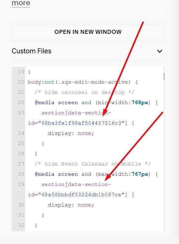
    section[data-section-id="68ba3fa1f98af504457516c3"] {
      display: none;
    }
  }
  /* hide Event Calendar on Mobile */
  @media screen and (max-width:767px) {
    section[data-section-id="68a58bbbdf53224db1b087ce"] {
      display: none;
    }
  }
}
Remember to update ID of both sections
#6. Use this code to Code Injection > Footer
Each site will require a different code. You can provide link to EVENT PAGE on your site. I will give code of this step.
You can also use Pro version, so you can get code & add URL easier.
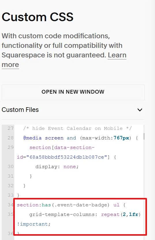
#7. To change Carousel to 2 items/row on Mobile, use this extra code under #5 code in Custom CSS box.
section:has(.event-date-badge) ul {
    grid-template-columns: repeat(2,1fr) !important;
}
#8. Result