Description
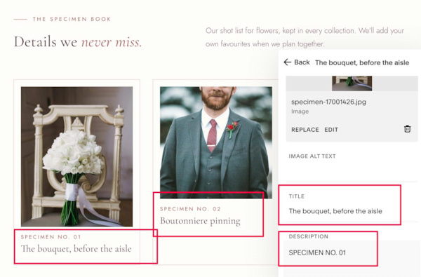
- Want your List Section to feel less uniform? This CSS gives some cards taller images than others, moves the description above the title as a small colored label, and switches to two columns on mobile.
- buy me a coffee
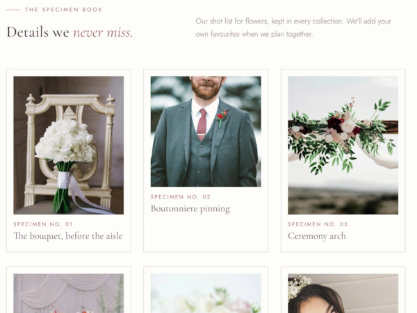
#1. Install Code
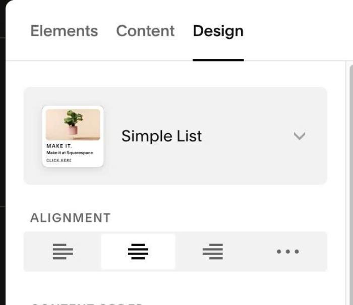
#1.1. First, make sure you added List Simple
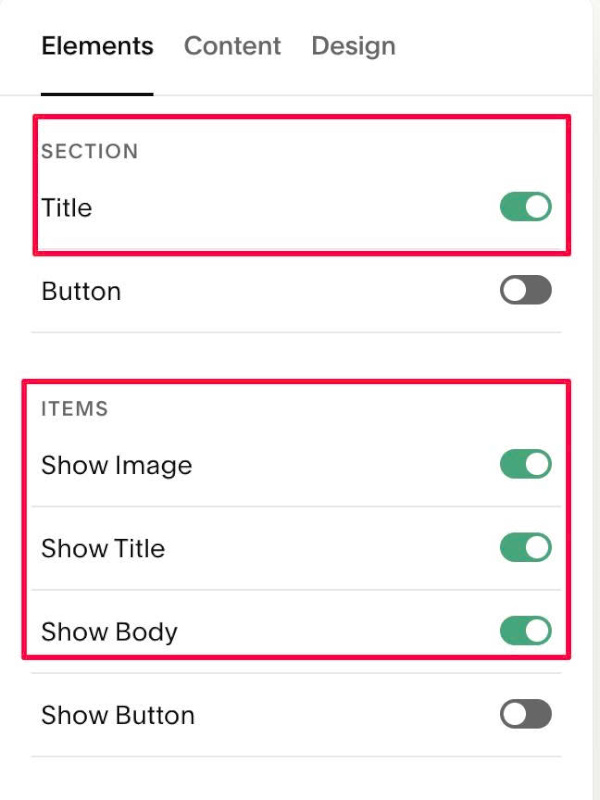
#1.2. Enable these options
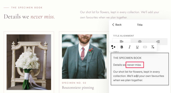
#1.3. Edit Section Title > Enter text like this. You can use italic text (then code will change its color)
#1.4. Edit each item > Enter desired image/text
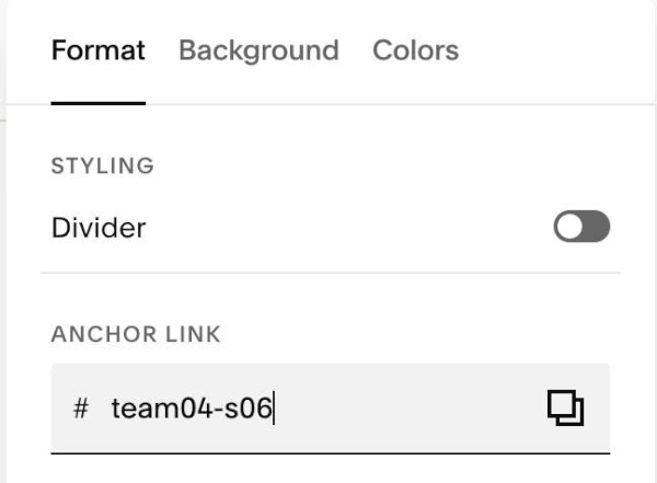
#1.5. Hover on top right of Section > Click EDIT SECTION > at Format > Anchor Link > enter word: team04-s06
#1.6. Next, use this code to Page Header Injection
<style>
#team04-s06 {
  --list-side-space: var(--sqs-site-gutter, 4vw);
  --list-side-space-mobile: var(--sqs-mobile-site-gutter, 6vw);
  --list-max-width: none;

  --title-text-align: left;
  --title-columns-gap: 40px;
  --title-mobile-row-gap: 24px;
  --title-line1-size: 11.5px;
  --title-line1-weight: 400;
  --title-line1-color: #9E5A5A;
  --title-line1-letter-spacing: .26em;
  --title-line1-space-below: 22px;
  --title-line1-line-width: 28px;
  --title-line1-line-height: 1px;
  --title-line1-line-color: #C98A86;
  --title-line1-line-gap: 12px;
  --title-line2-line-height: 1.08;
  --title-line2-bold-weight: 500;
  --title-line2-italic-weight: 400;
  --title-line2-italic-color: #9E5A5A;
  --title-line3-size: 16px;
  --title-line3-weight: 300;
  --title-line3-line-height: 1.7;
  --title-line3-color: #7A6570;
  --title-line3-max-width: 440px;

  --item-columns-mobile: 2;
  --item-gap-mobile: 16px;
  --section-background: #FFFDFA;
  --item-background: #FFFDFA;
  --item-border-width: 1px;
  --item-border-color: #E6D3CC;
  --item-radius: 0;
  --item-padding-mobile: 10px 10px 16px;
  --image-height-tall: 125%;
  --description-weight: 400;
  --description-color: #9E5A5A;
  --description-letter-spacing: .2em;
  --description-letter-spacing-mobile: .1em;
  --description-space-below: 4px;

  .user-items-list {
    box-sizing: border-box;
    max-width: var(--list-max-width);
    margin-inline: auto;
    padding-inline: var(--list-side-space) !important;
  }
  .list-section-title {
    display: grid;
    grid-template-columns: 1fr auto;
    column-gap: var(--title-columns-gap);
    align-items: end;
    text-align: var(--title-text-align);
    > p:nth-of-type(1) {
      grid-column: 1;
      grid-row: 1;
      display: flex;
      align-items: center;
      gap: var(--title-line1-line-gap);
      margin: 0 0 var(--title-line1-space-below);
      font-family: var(--body-font-font-family);
      font-size: var(--title-line1-size);
      font-weight: var(--title-line1-weight);
      font-style: var(--body-font-font-style);
      line-height: var(--body-font-line-height);
      letter-spacing: var(--title-line1-letter-spacing);
      color: var(--title-line1-color);
      &::before {
        content: "";
        flex: none;
        width: var(--title-line1-line-width);
        height: var(--title-line1-line-height);
        background-color: var(--title-line1-line-color);
      }
    }
    > p:nth-of-type(2) {
      grid-column: 1;
      grid-row: 2;
      margin: 0;
      line-height: var(--title-line2-line-height);
      strong {
        font-weight: var(--title-line2-bold-weight);
      }
      em {
        font-weight: var(--title-line2-italic-weight);
        color: var(--title-line2-italic-color);
      }
    }
    > p:nth-of-type(3) {
      grid-column: 2;
      grid-row: 1 / span 2;
      align-self: end;
      max-width: var(--title-line3-max-width);
      margin: 0;
      font-family: var(--body-font-font-family);
      font-size: var(--title-line3-size);
      font-weight: var(--title-line3-weight);
      font-style: var(--body-font-font-style);
      line-height: var(--title-line3-line-height);
      letter-spacing: var(--body-font-letter-spacing);
      color: var(--title-line3-color);
    }
  }
  .list-item {
    box-sizing: border-box;
    align-self: stretch;
    border: var(--item-border-width) solid var(--item-border-color);
    border-radius: var(--item-radius);
    background-color: var(--item-background);
    &:nth-child(1),
    &:nth-child(3),
    &:nth-child(6),
    &:nth-child(7) {
      --image-height: var(--image-height-tall);
    }
  }
  .section-background {
    background-color: var(--section-background) !important;
  }
  .list-item-media-inner {
    padding-bottom: var(--image-height, 100%) !important;
  }
  .list-item-content__text-wrapper {
    display: flex;
    flex-direction: column;
    > * {
      margin-inline: 0;
      max-width: 100%;
    }
  }
  .list-item-content__description {
    order: -1;
    margin-bottom: var(--description-space-below);
    p {
      margin: 0;
      font-weight: var(--description-weight);
      letter-spacing: var(--description-letter-spacing);
      color: var(--description-color);
    }
  }
  @media (max-width: 767px) {
    .user-items-list {
      padding-inline: var(--list-side-space-mobile) !important;
    }
    .list-section-title {
      grid-template-columns: 1fr;
      row-gap: var(--title-mobile-row-gap);
      > p:nth-of-type(3) {
        grid-column: 1;
        grid-row: 3;
        justify-self: start;
        max-width: none;
      }
    }
    .user-items-list-item-container {
      grid-template-columns: repeat(var(--item-columns-mobile), minmax(0, 1fr)) !important;
      gap: var(--item-gap-mobile) !important;
    }
    .list-item {
      padding: var(--item-padding-mobile);
    }
    .list-item-content__description p {
      letter-spacing: var(--description-letter-spacing-mobile);
    }
  }
}
</style>
#1.7. Customize
To change gap between 3 lines of text in Section Title, edit this
--title-text-align: left;
--title-columns-gap: 40px;
--title-mobile-row-gap: 24px;
To change Section Title – First Line style, edit this
--title-line1-size: 11.5px;
--title-line1-weight: 400;
--title-line1-color: #9E5A5A;
--title-line1-letter-spacing: .26em;
--title-line1-space-below: 22px;
To change style of Line before First Line, edit this
--title-line1-line-width: 28px;
--title-line1-line-height: 1px;
--title-line1-line-color: #C98A86;
--title-line1-line-gap: 12px;
To change style of Second, Third Lines in Section Title, edit this
--title-line2-line-height: 1.08;
  --title-line2-bold-weight: 500;
  --title-line2-italic-weight: 400;
  --title-line2-italic-color: #9E5A5A;
  --title-line3-size: 16px;
  --title-line3-weight: 300;
  --title-line3-line-height: 1.7;
  --title-line3-color: #7A6570;
  --title-line3-max-width: 440px;
To change number of columns on mobile/section background/item background/item border, item padding (mobile), edit this
--item-columns-mobile: 2;
  --item-gap-mobile: 16px;
  --section-background: #FFFDFA;
  --item-background: #FFFDFA;
  --item-border-width: 1px;
  --item-border-color: #E6D3CC;
  --item-radius: 0;
  --item-padding-mobile: 10px 10px 16px;
  --image-height-tall: 125%;
To change description style, edit this
--description-weight: 400;
--description-color: #9E5A5A;
--description-letter-spacing: .2em;
--description-letter-spacing-mobile: .1em;
--description-space-below: 4px;