Description
- adding multi-columns to Dropdown Menu (2 columns, 3 columns, 4 columns, 5 columns..)
- view demo – password: abc
- buy me a coffee
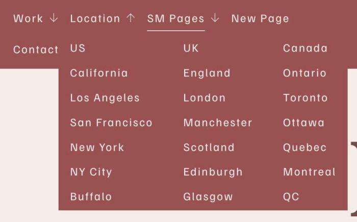
#1. Install Code
#1.1. First, hover on Dropdown > Click Gear icon

#1.2. Find URL Slug
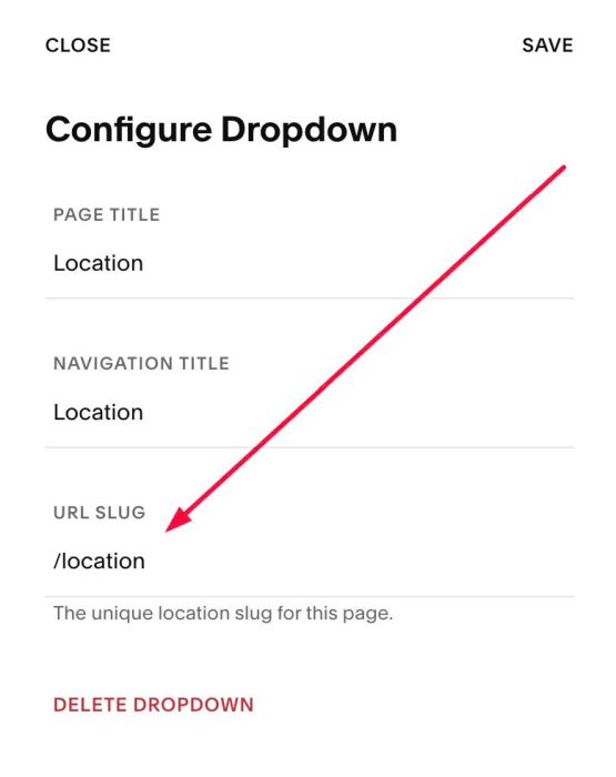
In my example, we will have: /location
and /sm-pages

#1.3. Use this code to Code Injection > Footer
- If you use Personal/Basic Plan and your plan doesn’t support Injection, see #3.1
<!-- 07.26c02v1 Dropdown Multi-Columns -->
<script>
window.NavColumnConfig = {
  dropdowns: [
    {
      dataHref: "/location",
      title: "Location",
      columns: 2,
      columnGap: "40px",
      firstItems: ["US", "UK", "Canada"],
      firstItemClickable: false,
      firstItemStyle: {
        // these lines are disabled
       // size: "18px",
       // bold: true,
       // color: "#111111"
      }
    },
    {
      dataHref: "/sm-pages",
      title: "SM Pages",
      columns: 4,
      columnGap: "32px",
      firstItems: ["Item 01", "Item 11", "Item 22", "Item 37"],
      firstItemClickable: true,
      firstItemStyle: {}
    }
  ]
};
</script>
<script src="https://code.beaverhero.com/header/0726c02v1dropdownmulticolumns.js"></script>
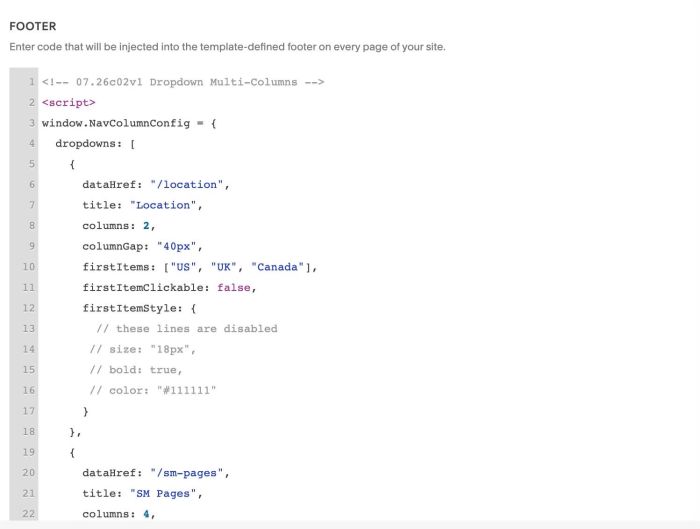
#1.4. Update Dropdown URL Slug + Items in Line 04 to Line 28 (explain below)
dropdowns: [
    {
      dataHref: "/location",
      title: "Location",
      columns: 2,
      columnGap: "40px",
      firstItems: ["US", "UK", "Canada"],
      firstItemClickable: false,
      firstItemStyle: {
        // these lines are disabled
       // size: "18px",
       // bold: true,
       // color: "#111111"
      }
    },
    {
      dataHref: "/sm-pages",
      title: "SM Pages",
      columns: 4,
      columnGap: "32px",
      firstItems: ["Item 01", "Item 11", "Item 22", "Item 37"],
      firstItemClickable: true,
      firstItemStyle: {}
    }
  ]
Line 06, Line 20 is Dropdown URL Slug (you got in #1.2)
dataHref: "/location",
dataHref: "/sm-pages",
Line 07, Line 21 is Dropdown Title Name
title: "Location",
title: "SM Pages",
Line 08, Line 22 is Number of Columns you want to set
columns: 2,
columns: 4,
Line 10, Line 24: First item in each column
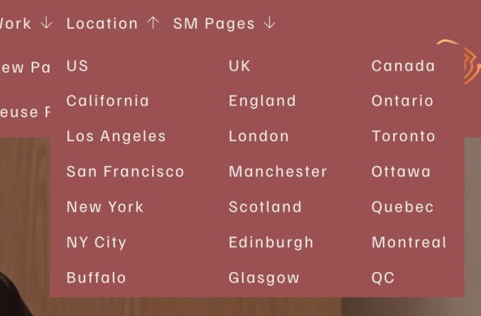
firstItems: ["US", "UK", "Canada"],
firstItems: ["Item 01", "Item 11", "Item 22", "Item 37"],
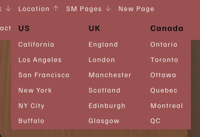
If you set this
firstItems: ["US", "UK", "Canada"],
result
if you set this
firstItems: ["Item 01", "Item 11", "Item 22", "Item 37"],
result

#2. Customize
#2.1. To make first item on each column clickable or non-clickable, just change this line
- false = non-clickable
- true = clickable
firstItemClickable: false,
#2.2. To change gap between Columns, change this line
columnGap: "32px",
#2.3. To change style of first item in each column, you can see Line 12 to Line 17
firstItemStyle: {
        // these lines are disabled
       // size: "18px",
       // bold: true,
       // color: "#111111"
      }
you can change it to something like this
firstItemStyle: {
       size: "18px",
       bold: true,
       color: "#111111"
      }
#3. Other
#3.1. If you use Personal/Basic Plan and your plan doesn’t support Injection, you can edit Site Footer.
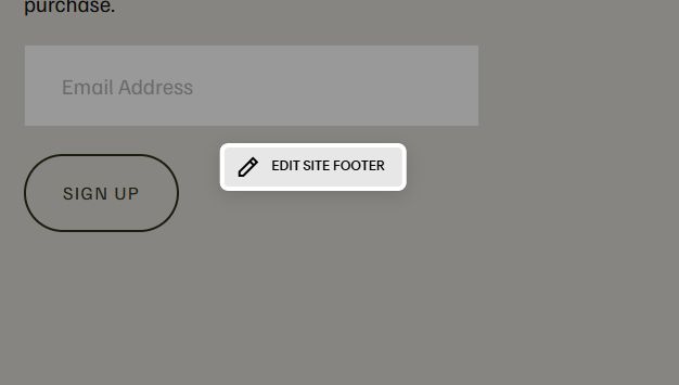
Add a Markdown Block
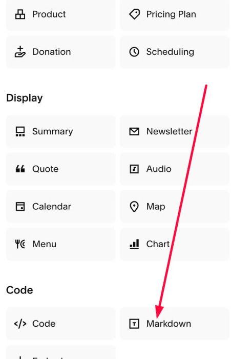
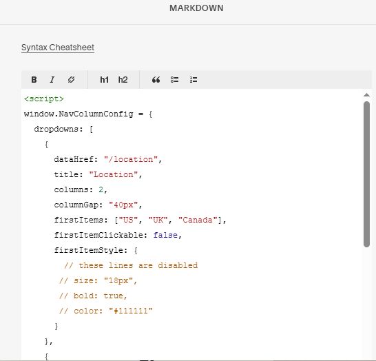
Add this code into Markdown Block
<script>
window.NavColumnConfig = {
  dropdowns: [
    {
      dataHref: "/location",
      title: "Location",
      columns: 2,
      columnGap: "40px",
      firstItems: ["US", "UK", "Canada"],
      firstItemClickable: false,
      firstItemStyle: {
        // these lines are disabled
       // size: "18px",
       // bold: true,
       // color: "#111111"
      }
    },
    {
      dataHref: "/sm-pages",
      title: "SM Pages",
      columns: 4,
      columnGap: "32px",
      firstItems: ["Item 01", "Item 11", "Item 22", "Item 37"],
      firstItemClickable: true,
      firstItemStyle: {}
    }
  ]
};
</script>
<script src="https://code.beaverhero.com/header/0726c02v1dropdownmulticolumns.js"></script>
#3.2. To change number columns on specific screen size, use new code like this
<!-- 07.26c02v1(v2) Dropdown Multi-Columns v2 -->
<script>
window.NavColumnConfig = {
  dropdowns: [
    {
      dataHref: "/location",
      title: "Location",
      columns: 3,
      columnGap: "40px",
      responsive: [
        { maxWidth: 1120, columns: 2 },
        { maxWidth: 640, columns: 1 }
      ],
      firstItems: ["US", "UK", "Canada"],
      firstItemClickable: false,
      firstItemStyle: {
        size: "18px",
        bold: true,
        color: "#111111"
      }
    },
    {
      dataHref: "/sm-pages",
      title: "SM Pages",
      columns: 4,
      columnGap: "32px",
      responsive: [
        { maxWidth: 991, columns: 3 },
        { maxWidth: 640, columns: 2 }
      ],
      firstItems: [],
      firstItemClickable: true,
      firstItemStyle: {}
    }
  ]
};
</script>
<script src="https://code.beaverhero.com/header/0726c02v1v2dropdownmulticolumnsv2.js"></script>
You will see line 10 – line 13
- change it to 2 columns on screen size under 1000px (so it will be 2 columns from 641px to 999px)
- change it to 1 columns on screen size under 640px
responsive: [
        { maxWidth: 1000, columns: 2 },
        { maxWidth: 640, columns: 1 }
      ],