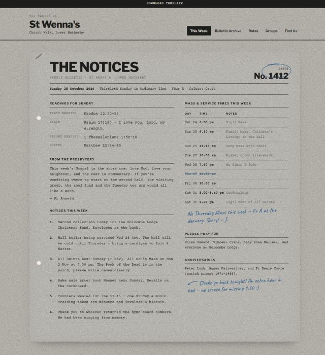
294. Notices

294. Notices

Notices is the printed weekly bulletin, put online: typed announcements, a corkboard of pinned notes, ruled tables and the odd biro scribble in the margin. It’s built for small parishes and chapels that want their website to feel like the sheet handed out at the door, local, warm, a little cluttered on purpose, and free of marketing language. Grainy black-and-white photography and paper textures keep the whole thing feeling photocopied rather than polished.
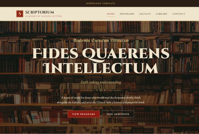
290. Scriptorium

290. Scriptorium

Scriptorium is inspired by the pages of a hand-copied medieval codex: warm parchment tones, deep ink, rubric red and touches of gold. It’s made for seminaries, theology schools and Bible study communities who want a site that feels reverent, scholarly and timeless. Illuminated capitals, ornamental borders and notes in the margins give every page the quiet dignity of a manuscript.

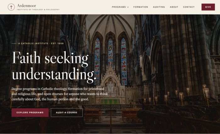
288. Ardenmoor

288. Ardenmoor

Ardenmoor is a dignified, classical template for Catholic institutes, seminaries and schools of theology and philosophy. Ivory and claret tones, Roman numerals and fine double rules give it the quiet authority of an old library, while a clear structure makes degrees, formation and open courses easy to find. A dedicated giving page helps turn visitors into supporters of your mission.

Buy me a coffee