294. Notices

294. Notices

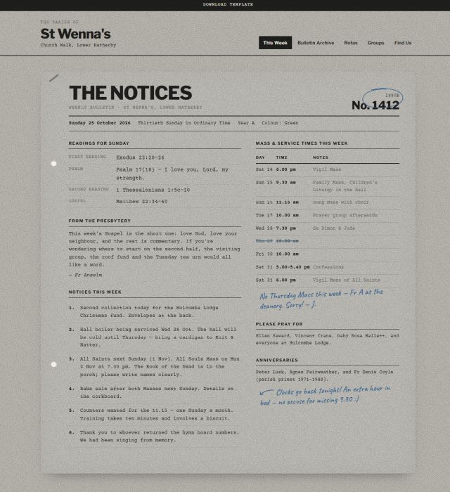
Notices is the printed weekly bulletin, put online: typed announcements, a corkboard of pinned notes, ruled tables and the odd biro scribble in the margin. It’s built for small parishes and chapels that want their website to feel like the sheet handed out at the door, local, warm, a little cluttered on purpose, and free of marketing language. Grainy black-and-white photography and paper textures keep the whole thing feeling photocopied rather than polished.
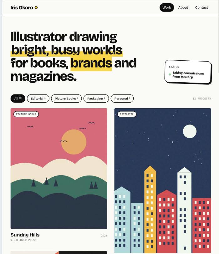
188. Inkling

188. Inkling

Inkling is a bold, minimal portfolio template that puts illustration front and center. A clean two-column masonry layout lets artwork of any shape sit naturally side by side, while big uppercase type and thick black rules give the site a confident, graphic personality. With a simple top navigation and plenty of white space, nothing competes with your work.

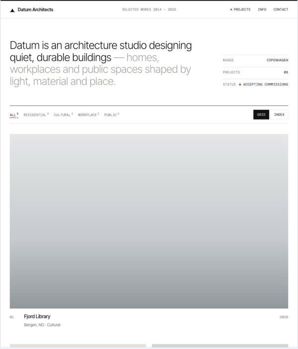
183. Datum

183. Datum

Datum is a clean, minimal portfolio template made for architects and design studios who want their buildings to speak for themselves. Generous white space, fine lines and precise technical typography give it the calm clarity of a well-drawn plan. All projects live on the homepage, and each one opens into a detailed, vertical-scrolling case study.

179. Sable

179. Sable

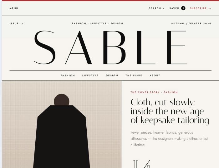
Sable is a sleek, modern publication template with the unmistakable character of a high-end fashion magazine. A grand masthead, elegant serif headlines, crisp editorial rules and a single rouge accent make every story feel like a printed spread. It’s designed to help readers discover the most exciting articles in fashion, lifestyle and design.

173. Kiosk 1 (1)

173. Kiosk

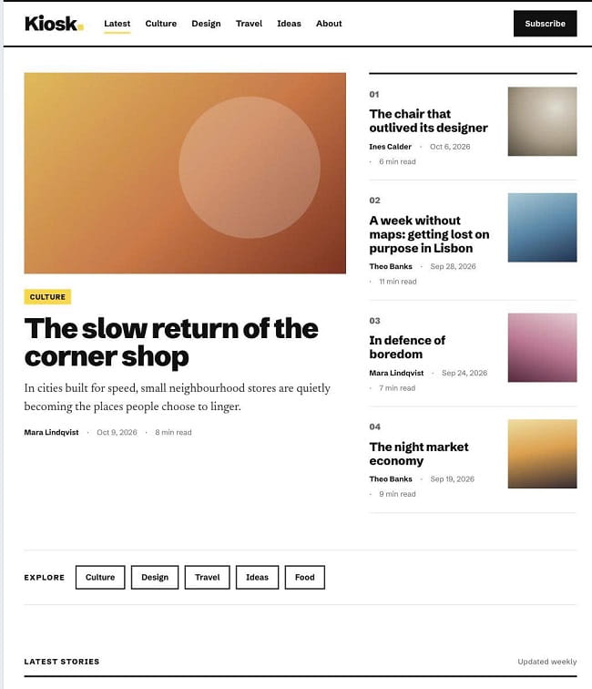
Kiosk is a clean, bold and content-focused template made for people who love long-form reading. Strong headlines, a comfortable serif reading font and big, full-width cover images give every story room to breathe. It’s a natural fit for online magazines, journals and personal blogs that want a modern editorial look without clutter.

170. Axiom 1 (1)

170. Axiom

Axiom is a bold, minimalist template built for consultants and service professionals who want to look sharp, strategic and confident online. Heavy condensed typography, a strict grid and a single signal-orange accent create a clean, no-nonsense look that puts your expertise front and center. Every page is structured to guide visitors from first impression to booked call.

124. Hot Issue 1 (1)

124. Hot Issue

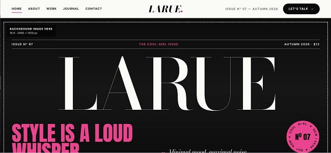
Hot Issue takes its cues from the pages of a fashion magazine, mixing a cool-girl attitude with editorial typography and a black-and-white palette lit up by hot pink. It’s built for stylists, creatives and personal brands who want minimal coolness wrapped in maximalist expression. The whole site reads like a new issue: bold, playful and impossible to scroll past.

Buy me a coffee