239. Dolly Frame

239. Dolly Frame

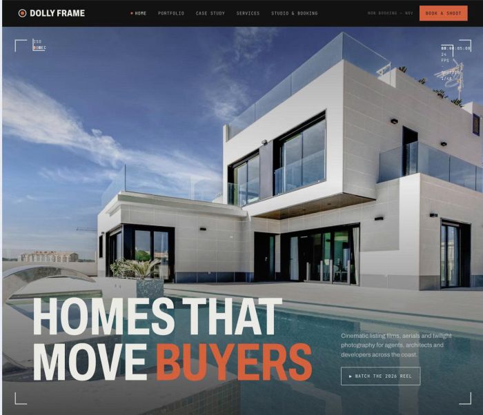
Dolly Frame is a dark, cinematic portfolio built around the way a camera sees a property: viewfinder details, running timecode and horizontal galleries that show every frame at its true shape. It is designed for videographers and photographers who sell homes through film and want their work to fill the screen. The overall feel is confident and technical, closer to a production studio than a brochure.

229. Plinth

229. Plinth

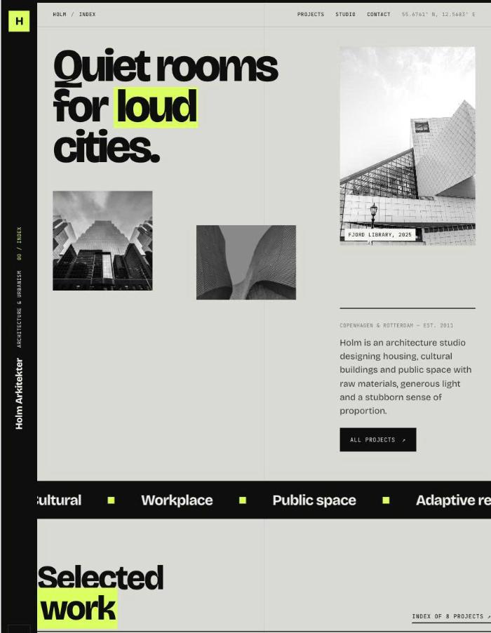
Plinth is a bold, design-forward template for architecture studios that want their website to feel as considered as their buildings. Oversized type, a concrete-and-acid colour palette and a staggered layout of mixed image sizes give it a confident, contemporary edge. Each project unfolds in a vertical gallery made for walking through a building image by image.

184. Atrium

184. Atrium

Atrium is a calm, gallery-like portfolio for architects and interior designers who want the work to do the talking. Warm off-white tones, fine lines and a clean sans paired with an elegant italic serif give it a quiet, Scandinavian feel. At its heart is a masonry project grid with click-to-enlarge images and layout controls that let every studio shape the grid its own way.

183. Datum

183. Datum

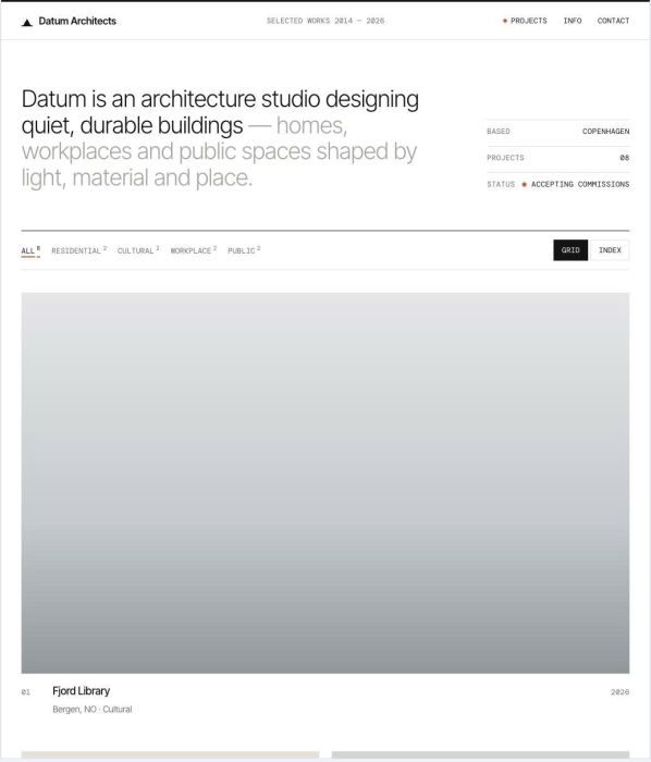
Datum is a clean, minimal portfolio template made for architects and design studios who want their buildings to speak for themselves. Generous white space, fine lines and precise technical typography give it the calm clarity of a well-drawn plan. All projects live on the homepage, and each one opens into a detailed, vertical-scrolling case study.

178. Strata

178. Strata

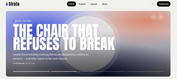
Strata is a carefully crafted magazine template with a bold, modern look, made for sharing inspiring stories from every discipline. Tall condensed headlines, elegant serif text and soft colour-gradient illustrations give each section its own colour and personality. Its standout feature is a collection of six post header layouts, so every story can open in its own way.

156. Marlowe 1 (1)

156. Marlowe

Marlowe is an editorial, minimal template for interior designers ready to move beyond a generic website. Refined serif typography, a warm natural palette and immersive scroll animations – a hero image that shrinks as you scroll, smooth scrolling and background colours that shift from section to section – make a memorable first impression. Every page is built to guide visitors from your projects and services towards an enquiry.

152. Plumb 1 (1)

152. Plumb

Plumb is a bold, no-nonsense template for construction companies that want to look as solid online as their work on site. Heavy condensed headlines, concrete tones, safety-yellow accents and blueprint-style details give it a confident, industrial feel without losing clarity. It is built to turn visitors into quote requests, with strong calls to action on every page.

15. Adrian Cole 1 (1)

15. Adrian Cole

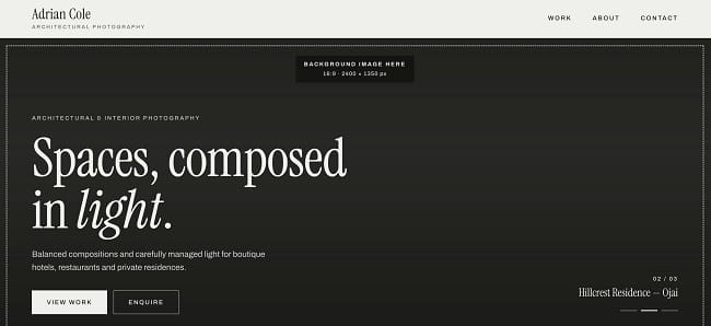
Adrian Cole is a calm, editorial template for architectural and interior photographers. It pairs a warm stone palette with refined serif headlines and generous white space. Every page is built to let photographs of spaces breathe.

125. Kozo 1 (1)

125. Kozo

Kōzō is a calm, minimal editorial template inspired by Japanese culture, with warm paper tones, ink-black type and a single vermilion accent. It is built for design studios that want to tell the story behind their work clearly and quietly. Generous white space, refined serif typography and slow, gentle motion make the whole site feel considered and unhurried.

111. Vellum

111. Vellum

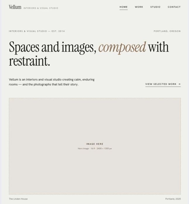
Vellum is a refined, editorial-style website template for creatives who want their work to speak for itself. Generous whitespace, elegant serif typography and asymmetric layouts give interior designers, photographers and studios a calm, confident home online. The result feels quiet and considered, the way a well-made space should.

38. Ashgrain Photography 1 (1)

38. Ashgrain Photography

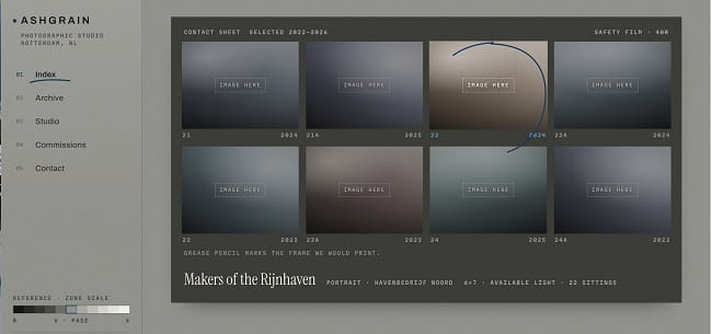
ASHGRAIN is a studio-first photography template built around the materials of the darkroom — a contact sheet, a grease-pencil mark, a neutral grey wall. It is made for photographers who sell considered work rather than volume, and who want the site to feel like a working studio instead of a gallery brochure. The overall feeling is quiet, technical, and confident.

Buy me a coffee