Description
- No plugin needed for pricing tables. Just format the List Section description with strikethrough, a bullet list and underline, and this CSS turns each item into a pricing card, with one card highlighted as your featured package
- buy me a coffee
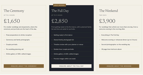
#1. Install Code
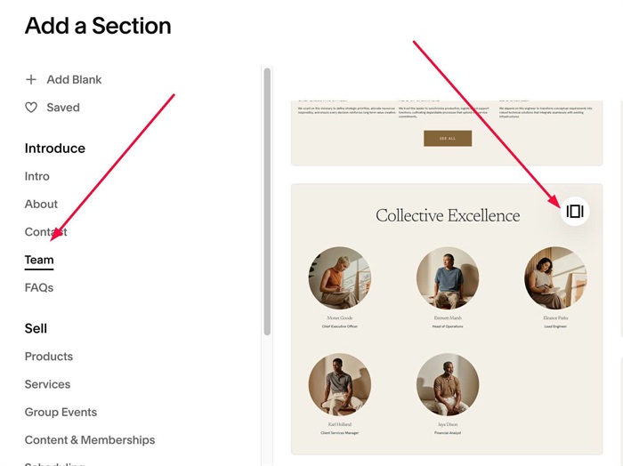
#1.1. First, click Add Section > Choose Team > Choose section with icon in top right
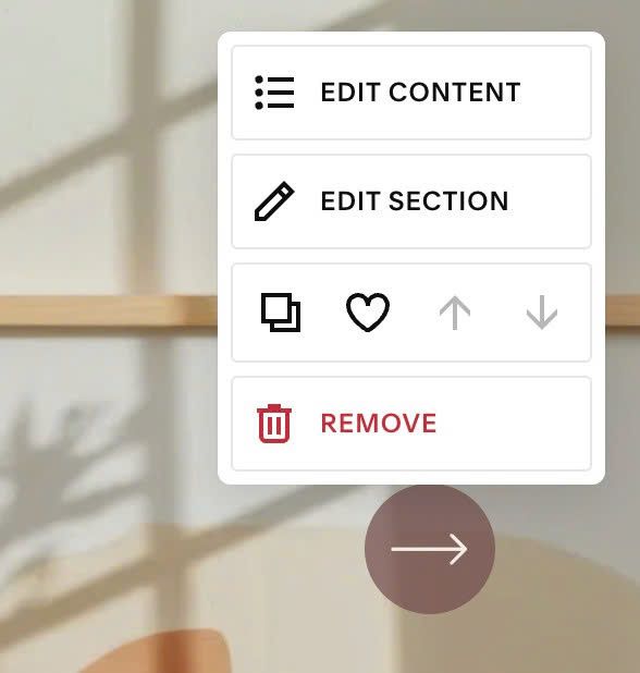
#1.2. Next, hover on top right of section > Click EDIT CONTENT
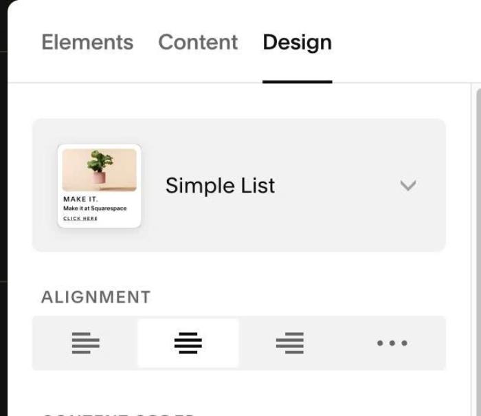
Choose Simple List
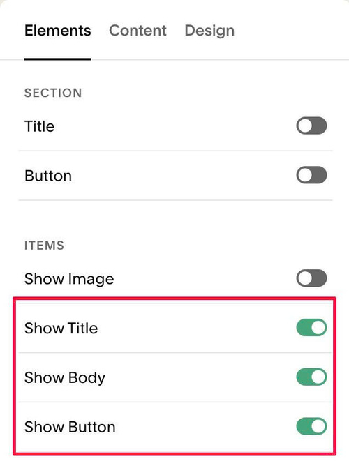
#1.3. at Elements > Enable these
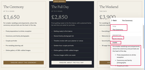
#1.4. Edit each item > Enter text like this
- First Line in Description = Second Line in Pricing Table Column
- Strikethrough text = Pricing
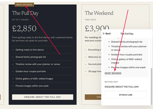
With label text, you can use UNDERLINE text
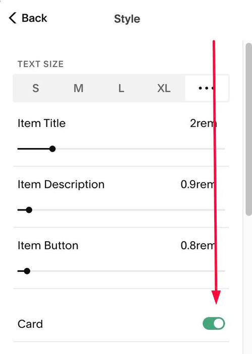
#1.5. at Design > Style > Enable option: Card
#1.6. Hover on top right of section > Click EDIT SECTION
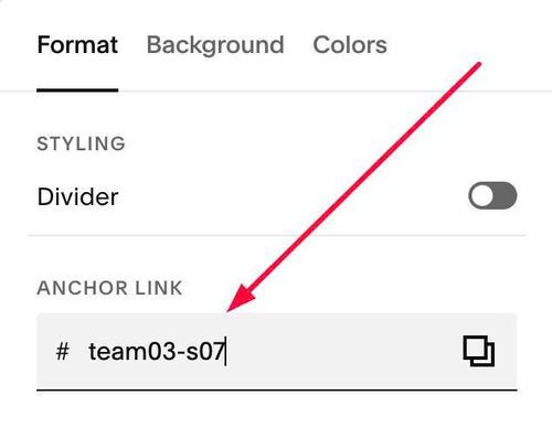
#1.7. at Format > Anchor Link > enter word: team03-s07
#1.8. Next, use this code to Custom CSS
#team03-s07 {
  --item-border-color: #B9AD98;
  --item-border-thickness: 1px;

  --active-item-background: var(--sqsp-palette-darkest-color);
  --active-item-border-color: var(--sqsp-palette-darkest-color);
  --active-item-title-color: var(--sqsp-palette-lightest-color);
  --active-item-text-color: rgba(244, 240, 232, .7);

  --first-line-size: 12px;
  --first-line-color: var(--sqsp-palette-dark-color);
  --first-line-letter-spacing: .12em;
  --first-line-uppercase: uppercase;
  --first-line-space-below: 0px;
  --active-first-line-color: rgba(244, 240, 232, .7);

  --price-size: 50px;
  --price-color: var(--sqsp-palette-darkest-color);
  --price-font-family: var(--heading-font-font-family);
  --price-font-weight: 300;
  --price-space-above: 26px;
  --price-space-below: 12px;
  --active-price-color: var(--sqsp-palette-lightest-color);

  --list-space-above: 24px;
  --list-space-below: 0px;
  --list-icon: url("data:image/svg+xml,%3Csvg xmlns='http://www.w3.org/2000/svg' viewBox='0 0 10 10'%3E%3Crect y='4.5' width='10' height='1'/%3E%3C/svg%3E");
  --list-icon-size: 10px;
  --list-icon-color: var(--sqsp-palette-accent-color);
  --list-icon-text-gap: 12px;
  --list-line-color: #D8CFBF;
  --list-line-thickness: 1px;
  --list-text-line-space: 12px;
  --active-list-icon-color: #C9AE80;
  --active-list-line-color: rgba(244, 240, 232, .18);
  --active-list-text-color: var(--sqsp-palette-lightest-color);

  --label-background: var(--sqsp-palette-accent-color);
  --label-color: var(--sqsp-palette-lightest-color);
  --label-position-left: 36px;

  --button-width: 100%;
  --button-hover-background: var(--sqsp-palette-accent-color);
  --button-hover-text-color: var(--sqsp-palette-lightest-color);
  --button-hover-border-color: var(--sqsp-palette-accent-color);
  --active-button-background: var(--sqsp-palette-lightest-color);
  --active-button-text-color: var(--sqsp-palette-darkest-color);
  --active-button-border-color: var(--sqsp-palette-lightest-color);
  --active-button-hover-background: #C9AE80;
  --active-button-hover-text-color: var(--sqsp-palette-darkest-color);
  --active-button-hover-border-color: #C9AE80;

  .list-item {
    position: relative;
    overflow: visible;
    border: var(--item-border-thickness) solid var(--item-border-color);
  }

  .list-item-content__description > p:first-child {
    margin: 0 0 var(--first-line-space-below);
    font-size: var(--first-line-size);
    letter-spacing: var(--first-line-letter-spacing);
    text-transform: var(--first-line-uppercase);
    color: var(--first-line-color);
  }

  .list-item-content__description > p:has(span[style*="line-through"]) {
    margin: var(--price-space-above) 0 var(--price-space-below);
    font-family: var(--price-font-family);
    font-size: var(--price-size);
    font-weight: var(--price-font-weight);
    line-height: 1;
    color: var(--price-color);
  }
  .list-item-content__description > p:has(span[style*="line-through"]) span {
    text-decoration: none !important;
  }

  .list-item-content__description > :has(+ ul) {
    margin-bottom: 0;
  }
  .list-item-content__description ul {
    margin: var(--list-space-above) 0 var(--list-space-below);
    padding: 0;
    list-style: none;
    border-top: var(--list-line-thickness) solid var(--list-line-color);
  }
  .list-item-content__description ul li {
    position: relative;
    margin: 0;
    padding: var(--list-text-line-space) 0 var(--list-text-line-space) calc(var(--list-icon-size) + var(--list-icon-text-gap));
    border-bottom: var(--list-line-thickness) solid var(--list-line-color);
    list-style: none;
  }
  .list-item-content__description ul li > p {
    margin: 0;
  }
  .list-item-content__description ul li > p::before {
    content: none !important;
    display: none !important;
  }
  .list-item-content__description ul li::before {
    content: "";
    position: absolute;
    left: 0;
    top: calc(var(--list-text-line-space) + (1lh - var(--list-icon-size)) / 2);
    width: var(--list-icon-size);
    height: var(--list-icon-size);
    background-color: var(--list-icon-color);
    -webkit-mask: var(--list-icon) center / contain no-repeat;
    mask: var(--list-icon) center / contain no-repeat;
  }

  .list-item-content__description > p:last-child:has(u) {
    position: absolute;
    top: 0;
    left: var(--label-position-left);
    margin: 0;
    padding: 5px 12px;
    transform: translateY(-50%);
    background: var(--label-background);
    color: var(--label-color);
    font-size: 11px;
    font-weight: 500;
    line-height: 1.4;
    letter-spacing: .16em;
    text-transform: uppercase;
  }
  .list-item-content__description > p:last-child u {
    text-decoration: none;
  }

  .list-item-content__button-container {
    width: 100%;
  }
  .list-item-content__button {
    width: var(--button-width);
    max-width: 100%;
    box-sizing: border-box;
    text-align: center;
  }
  .list-item-content__button:hover {
    background-color: var(--button-hover-background) !important;
    color: var(--button-hover-text-color) !important;
    border-color: var(--button-hover-border-color) !important;
  }

  .list-item:has(.list-item-content__description > p:last-child u) {
    background-color: var(--active-item-background) !important;
    border-color: var(--active-item-border-color);

    .list-item-content__title {
      color: var(--active-item-title-color) !important;
    }
    .list-item-content__description {
      color: var(--active-item-text-color) !important;
    }
    .list-item-content__description > p:first-child {
      color: var(--active-first-line-color);
    }
    .list-item-content__description > p:has(span[style*="line-through"]) {
      color: var(--active-price-color);
    }
    .list-item-content__description ul {
      border-top-color: var(--active-list-line-color);
    }
    .list-item-content__description ul li {
      border-bottom-color: var(--active-list-line-color);
      color: var(--active-list-text-color);
    }
    .list-item-content__description ul li::before {
      background-color: var(--active-list-icon-color);
    }
    .list-item-content__button {
      background-color: var(--active-button-background) !important;
      color: var(--active-button-text-color) !important;
      border-color: var(--active-button-border-color) !important;
    }
    .list-item-content__button:hover {
      background-color: var(--active-button-hover-background) !important;
      color: var(--active-button-hover-text-color) !important;
      border-color: var(--active-button-hover-border-color) !important;
    }
  }
}
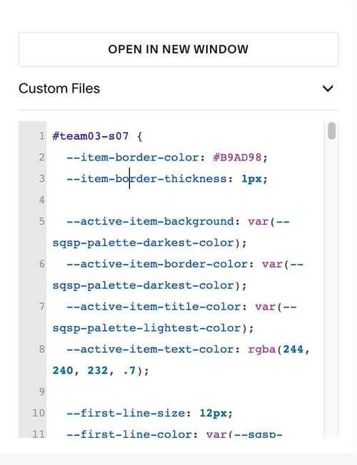
#1.9. Customize
All style options here (line 02 – line 51)
--item-border-color: #B9AD98;
  --item-border-thickness: 1px;

  --active-item-background: var(--sqsp-palette-darkest-color);
  --active-item-border-color: var(--sqsp-palette-darkest-color);
  --active-item-title-color: var(--sqsp-palette-lightest-color);
  --active-item-text-color: rgba(244, 240, 232, .7);

  --first-line-size: 12px;
  --first-line-color: var(--sqsp-palette-dark-color);
  --first-line-letter-spacing: .12em;
  --first-line-uppercase: uppercase;
  --first-line-space-below: 0px;
  --active-first-line-color: rgba(244, 240, 232, .7);

  --price-size: 50px;
  --price-color: var(--sqsp-palette-darkest-color);
  --price-font-family: var(--heading-font-font-family);
  --price-font-weight: 300;
  --price-space-above: 26px;
  --price-space-below: 12px;
  --active-price-color: var(--sqsp-palette-lightest-color);

  --list-space-above: 24px;
  --list-space-below: 0px;
  --list-icon: url("data:image/svg+xml,%3Csvg xmlns='http://www.w3.org/2000/svg' viewBox='0 0 10 10'%3E%3Crect y='4.5' width='10' height='1'/%3E%3C/svg%3E");
  --list-icon-size: 10px;
  --list-icon-color: var(--sqsp-palette-accent-color);
  --list-icon-text-gap: 12px;
  --list-line-color: #D8CFBF;
  --list-line-thickness: 1px;
  --list-text-line-space: 12px;
  --active-list-icon-color: #C9AE80;
  --active-list-line-color: rgba(244, 240, 232, .18);
  --active-list-text-color: var(--sqsp-palette-lightest-color);

  --label-background: var(--sqsp-palette-accent-color);
  --label-color: var(--sqsp-palette-lightest-color);
  --label-position-left: 36px;

  --button-width: 100%;
  --button-hover-background: var(--sqsp-palette-accent-color);
  --button-hover-text-color: var(--sqsp-palette-lightest-color);
  --button-hover-border-color: var(--sqsp-palette-accent-color);
  --active-button-background: var(--sqsp-palette-lightest-color);
  --active-button-text-color: var(--sqsp-palette-darkest-color);
  --active-button-border-color: var(--sqsp-palette-lightest-color);
  --active-button-hover-background: #C9AE80;
  --active-button-hover-text-color: var(--sqsp-palette-darkest-color);
  --active-button-hover-border-color: #C9AE80;
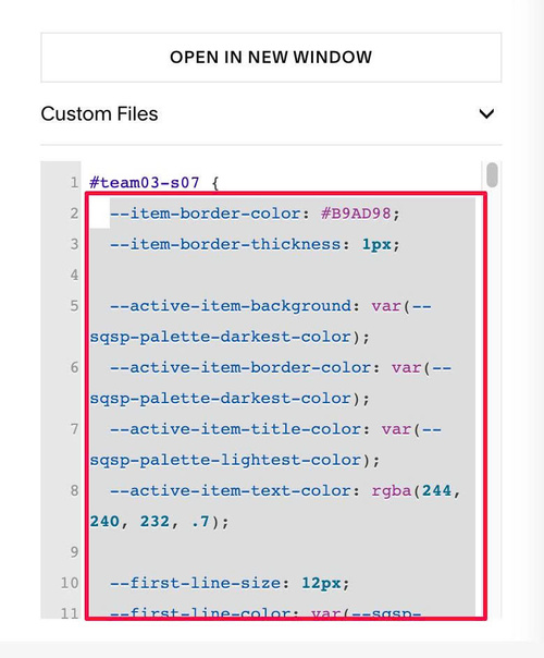
To change item border around each item, change this
--item-border-color: #B9AD98;
 --item-border-thickness: 1px;
To change most booked (middle item) style
--active-item-background: var(--sqsp-palette-darkest-color);
  --active-item-border-color: var(--sqsp-palette-darkest-color);
  --active-item-title-color: var(--sqsp-palette-lightest-color);
  --active-item-text-color: rgba(244, 240, 232, .7);
To change style of first line in Description, change these
--first-line-size: 12px;
 --first-line-color: var(--sqsp-palette-dark-color);
 --first-line-letter-spacing: .12em;
 --first-line-uppercase: uppercase;
 --first-line-space-below: 0px;
 --active-first-line-color: rgba(244, 240, 232, .7);
To change style of Price, change these
--price-size: 50px;
--price-color: var(--sqsp-palette-darkest-color);
--price-font-family: var(--heading-font-font-family);
--price-font-weight: 300;
--price-space-above: 26px;
--price-space-below: 12px;
--active-price-color: var(--sqsp-palette-lightest-color);
To change unordered list style (icon, text, lines, space), change these
--list-space-above: 24px;
 --list-space-below: 0px;
 --list-icon: url("data:image/svg+xml,%3Csvg xmlns='http://www.w3.org/2000/svg' viewBox='0 0 10 10'%3E%3Crect y='4.5' width='10' height='1'/%3E%3C/svg%3E");
 --list-icon-size: 10px;
 --list-icon-color: var(--sqsp-palette-accent-color);
 --list-icon-text-gap: 12px;
 --list-line-color: #D8CFBF;
 --list-line-thickness: 1px;
 --list-text-line-space: 12px;
 --active-list-icon-color: #C9AE80;
 --active-list-line-color: rgba(244, 240, 232, .18);
To change label Most Booked style, change these
--label-background: var(--sqsp-palette-accent-color);
  --label-color: var(--sqsp-palette-lightest-color);
  --label-position-left: 36px;
To change button hover style, middle button style, change these
--button-width: 100%;
  --button-hover-background: var(--sqsp-palette-accent-color);
  --button-hover-text-color: var(--sqsp-palette-lightest-color);
  --button-hover-border-color: var(--sqsp-palette-accent-color);
  --active-button-background: var(--sqsp-palette-lightest-color);
  --active-button-text-color: var(--sqsp-palette-darkest-color);
  --active-button-border-color: var(--sqsp-palette-lightest-color);
  --active-button-hover-background: #C9AE80;
  --active-button-hover-text-color: var(--sqsp-palette-darkest-color);
  --active-button-hover-border-color: #C9AE80;