I released update version of this code. You can check new version here.
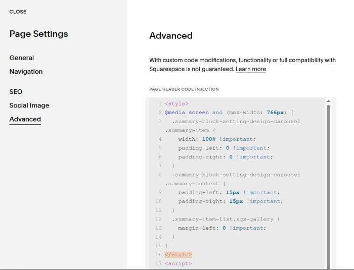
To make Carousel displaying only 1 item on mobile only, like this.
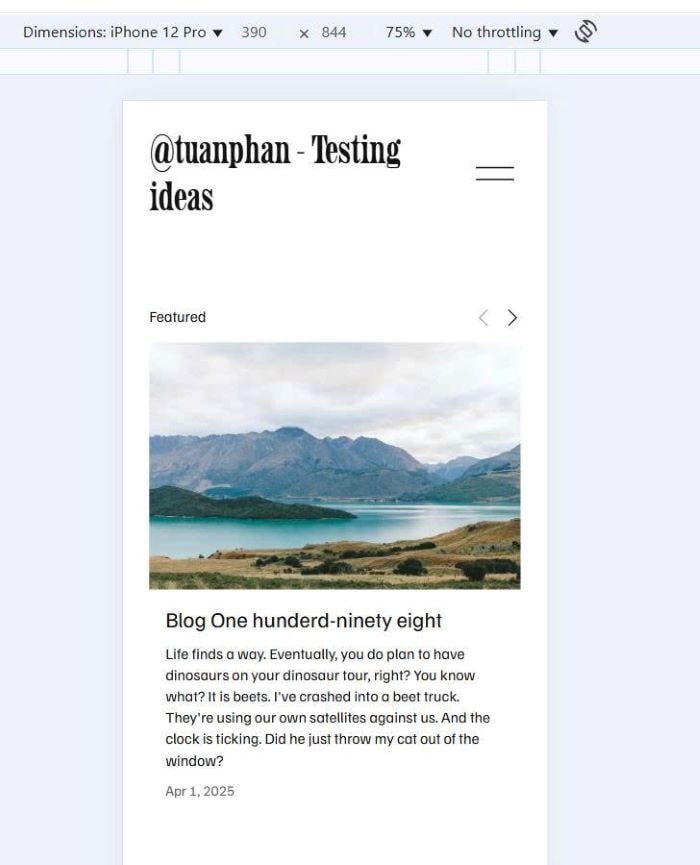
You can use this code to Page Header Injection (page where you use Carousel)
<style>
@media screen and (max-width: 766px) {
  .summary-block-setting-design-carousel .summary-item {
    width: 100% !important;
    padding-left: 0 !important;
    padding-right: 0 !important;
  }
  .summary-block-setting-design-carousel .summary-content {
    padding-left: 15px !important;
    padding-right: 15px !important;
  }
  .summary-item-list.sqs-gallery {
    margin-left: 0 !important;
  }
}
</style>
<script>
document.addEventListener('DOMContentLoaded', function() {
    let currentIndex = 0;
    let totalItems = 0;
    let itemsPerView = 3;
    let carousel = null;
    let prevButton = null;
    let nextButton = null;

    function initCarousel() {
        carousel = document.querySelector('.summary-item-list.sqs-gallery');
        if (!carousel) return;

        const items = carousel.querySelectorAll('.summary-item');
        totalItems = items.length;

        prevButton = document.querySelector('.summary-carousel-pager-prev');
        nextButton = document.querySelector('.summary-carousel-pager-next');

        if (!prevButton || !nextButton) return;

        updateItemsPerView();
        resetCarousel();

        prevButton.addEventListener('click', function(e) {
            e.preventDefault();
            e.stopPropagation();
            goToPrev();
        });

        nextButton.addEventListener('click', function(e) {
            e.preventDefault();
            e.stopPropagation();
            goToNext();
        });
    }

    function updateItemsPerView() {
        const newItemsPerView = window.innerWidth <= 766 ? 1 : 3;

        if (newItemsPerView !== itemsPerView) {
            itemsPerView = newItemsPerView;
            currentIndex = 0;
        }
    }

    function resetCarousel() {
        currentIndex = 0;
        updateCarousel();
    }

    function goToNext() {
        const maxIndex = Math.max(0, totalItems - itemsPerView);
        if (currentIndex < maxIndex) {
            currentIndex = Math.min(currentIndex + itemsPerView, maxIndex);
            updateCarousel();
        }
    }

    function goToPrev() {
        if (currentIndex > 0) {
            currentIndex = Math.max(currentIndex - itemsPerView, 0);
            updateCarousel();
        }
    }

    function updateCarousel() {
        if (!carousel) return;

        let translateX;
        if (window.innerWidth <= 766) {
            translateX = -(currentIndex * 100);
        } else {
            const itemWidth = 100 / itemsPerView;
            translateX = -(currentIndex * itemWidth);
        }

        carousel.style.setProperty('transform', `translateX(${translateX}%)`, 'important');
        carousel.style.setProperty('transition', 'transform 0.3s ease', 'important');

        setTimeout(() => {
            if (window.innerWidth <= 766) {
                const checkTranslateX = -(currentIndex * 100);
                carousel.style.setProperty('transform', `translateX(${checkTranslateX}%)`, 'important');
            }
        }, 50);

        const maxIndex = Math.max(0, totalItems - itemsPerView);
        prevButton.classList.toggle('sqs-disabled', currentIndex === 0);
        nextButton.classList.toggle('sqs-disabled', currentIndex >= maxIndex);

        const items = carousel.querySelectorAll('.summary-item');
        items.forEach((item, index) => {
            if (index >= currentIndex && index < currentIndex + itemsPerView) {
                item.classList.add('sqs-active-slide');
                const links = item.querySelectorAll('a');
                links.forEach(link => link.removeAttribute('tabindex'));
            } else {
                item.classList.remove('sqs-active-slide');
                const links = item.querySelectorAll('a');
                links.forEach(link => link.setAttribute('tabindex', '-1'));
            }
        });
    }

    function handleResize() {
        updateItemsPerView();
        resetCarousel();
    }

    window.addEventListener('resize', handleResize);

    initCarousel();
});
</script>